|
| |
AKA :
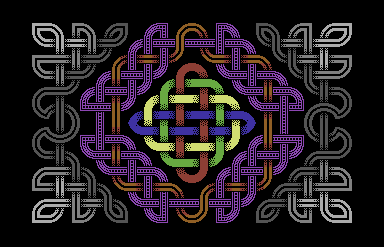
Pictish Worms
Credits :
Download :
Look for downloads on external sites:
Pokefinder.org
User Comment
Submitted by Ragnarok on 30 September 2010
User Comment
Submitted by Jucke on 30 June 2010
| Really nice. I agree with Frantic. |
User Comment
Submitted by Jak T Rip on 19 June 2010
| Very well done, Saehn. I could imagine this animated. |
User Comment
Submitted by Thunder.Bird on 8 June 2010
| Input the shape to a flokatimachine!!! ftw |
User Comment
Submitted by Motion on 4 June 2010
| This reminds me of work done by Wayne Schmidt. Very nice saehn! |
User Comment
Submitted by NecroPolo on 3 June 2010
| I totally agree with Frantic: the somewhat reverse direction either makes this work timeless and valuable. I can't emphasize enough how I like this style. 10/10 |
User Comment
Submitted by Hoild on 3 June 2010
I love minimalistic GFX, and this is a nice motif. However, the dithering as it is is too rough for me. I realize it is HIRES and all, but still I would like to see it redone in NUFLI, IFLI, or even interlaced HIRES, with a finer dithering and better detailed "Z axis" effect on the crossing strands.
EDIT: Just as an extra note, it looks very much like a well-made speccy GFX, and from me that should be taken as a compliment. I like well-made speccy GFX... ..but the C64 can do even better. \;]> |
User Comment
Submitted by Twoflower on 2 June 2010
User Comment
Submitted by Frantic on 2 June 2010
| What I like in particular about this picture is that it is not the result of an obsession of doing something that is difficult to realize on a C64 due to lack of colors etc, but is instead simply focused on doing something that looks nice by means of form/geometry etc. Relieving, sort of. |
User Comment
Submitted by saehn on 2 June 2010
| Thanks, all. @Jazzcat: that's a really good idea and I'll have to see if I can get the guys to implement it for a similar picture in a future release. @enthusi: thanks, fixed! |
User Comment
Submitted by daison on 2 June 2010
User Comment
Submitted by enthusi on 2 June 2010
Very nice :)
What about the light red spot on the upper left? Puzzles me :)
@Deadbone:
Hires Editor V1.5 |
User Comment
Submitted by DeadBone / Hype on 2 June 2010
| Very nicely styled image. Would definately improve even more the impact of the design if made animated by code. I love good use of hires colour, i'd love to try it myself sometime. Who can reccomend a good simple hires art program on real hardware for me? |
User Comment
Submitted by Fredrik on 2 June 2010
User Comment
Submitted by McMeatLoaf on 2 June 2010
User Comment
Submitted by Twoflower on 1 June 2010
| Very nice! Good use of hires. I agree with Jazzcat about adding code to it. Some colorscrolling or animation should add wonders. |
User Comment
Submitted by Deev on 1 June 2010
User Comment
Submitted by PAL on 1 June 2010
| fantastic... it reminds me of something... ohh... well... absolutely fantastic! We love such stoff like this... |
User Comment
Submitted by Conrad on 1 June 2010
| Simple hires always wins, thanks to people like saehn! Fantastic! |
User Comment
Submitted by Ksubi on 1 June 2010
| Absolutely beautiful. Nice Job! |
User Comment
Submitted by Jazzcat on 1 June 2010
| Nice. I would like to see this in a demo effect (loader) so that the strands are being woven in real-time. |
|
|
|
 | Search CSDb |
|
 | Navigate |  |
|
 | Detailed Info |  |
|
 | Fun Stuff |  |
· Goofs
· Hidden Parts
· Trivia
|
|
 | Forum |  |
|
 | Support CSDb |  |
|
 |  |
|


