|
| |
Credits :
Download :
Look for downloads on external sites:
Pokefinder.org
User Comment
Submitted by plagueis on 2 September 2010
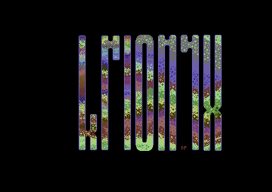
| Yeah, the "X" is actually, I believe, one pixel lower than the other letters...not sure if there are any height inconsistencies on top. I was wondering if anyone would mention these things ;) These are additional reasons why this wasn't used in a demo. I did a similar logo to this in the past, which was more symmetrical, but it was just an outline...something I used in a full screen logo swing. |
User Comment
Submitted by Moloch on 2 September 2010
Like the fillpattern, but as mentioned, I'd probably line up all the letters mid points k/x and r/n/y to be more appealing to the eyes. Also, it appears some of the letters aren't 100% same height? (That might be the preview image here on CSDb)
|
User Comment
Submitted by Ksubi on 2 September 2010
| Interesting colour combinations, refreshing in ways. Nice to see a different format (from the usual m/c) being used also. The only thing i'd change is make the "k" and the "x" have similar crossover points, so they align horizontally with each other (so shrink the "x"). Just more harmonious to the eye :) |
User Comment
Submitted by The Phantom on 2 September 2010
After seeing the finished product, I also downloaded the Topaz editor. I'm looking forward to creating something in the future with it.
DPL: This turned out nice man. Keep up the good work! Nice to see a coder do art (wink). I do like how this came out, but I think I'm going to have to school you on color blending and the like.
Good job man! |
User Comment
Submitted by Jon on 1 September 2010
User Comment
Submitted by plagueis on 31 August 2010
User Comment
Submitted by Kickback on 31 August 2010
| Sweet! What drawing program did you use to make the logo? |
User Comment
Submitted by The Shadow on 31 August 2010
User Comment
Submitted by daison on 31 August 2010
| The outlines seem so much better when filled. Rather cool for a coder's logo ;) |
User Comment
Submitted by plagueis on 31 August 2010
User Comment
Submitted by Hermit on 30 August 2010
| Brilliant colour use. A material that I've never seen before on C64. |
User Comment
Submitted by Fuzz on 30 August 2010
User Comment
Submitted by plagueis on 30 August 2010
| Here's a logo I painted sometime last year and went a little bit crazy with all the hires color freedom I suddenly had ;) I felt like this didn't really fit into any of my future demo design schemes, so why not release it as a stand alone AFLI pic? Hopefully my future forays into the more specialized graphics modes will find me more experienced in pixel self-control :) It actually looks decent to me on PAL via a CRT monitor, or on vice with PAL emulation on. To see it in NTSC you'd have to save from $4000 to $7fff and use a different viewer or mod this. |
|
|
|
 | Search CSDb |
|
 | Navigate |  |
|
 | Detailed Info |  |
|
 | Fun Stuff |  |
· Goofs
· Hidden Parts
· Trivia
|
|
 | Forum |  |
|
 | Support CSDb |  |
|
 |  |
|


