|
| |
Released At :
Syntax 2011
Achievements :
Mixed Graphics Competition at Syntax 2011 : #1
Credits :
Download :
Look for downloads on external sites:
Pokefinder.org
User Comment
Submitted by Hermit on 18 November 2011
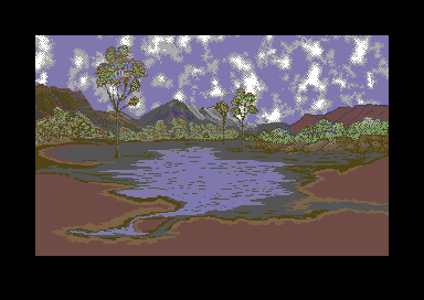
The style of the trees reminds me of some golf game from the past. And the overall gives me some 'Stalker' feel. (I associate Stalker too much times, but it's my fav. game today.)
I like the low-contrast approach, which together with 'high' resolution gives a professional video-interface experience and calming emotions. |
User Comment
Submitted by Frantic on 17 November 2011
User Comment
Submitted by Rough on 17 November 2011
| Hm, the picture as standalone is quite average, but it would well fit into an adventure game. |
User Comment
Submitted by PAL on 17 November 2011
| deizi: that is an awesome comment, when you typed that I see it too... ha ha lol |
User Comment
Submitted by deizi on 17 November 2011
User Comment
Submitted by Conjuror on 17 November 2011
| It was drawn in Timanthes on a tablet PC. The clouds were generated in that program, but a lot of pixel work to blend them. |
User Comment
Submitted by Cobra/Samar on 17 November 2011
| interesting, but if graphics were drawn on the original C64 or PC and converted? |
User Comment
Submitted by E$G on 16 November 2011
| realistic ... impressive the sky clouds |
User Comment
Submitted by hedning on 16 November 2011
| I like it! But I somewhat agree about the sand part. |
User Comment
Submitted by Maxlide on 16 November 2011
Some naked chicks on the sand would changed the scenery! ;)
Nice picture! |
User Comment
Submitted by Conjuror on 16 November 2011
| And I agree. It was a bit/lot unfinished to get it out at the party, but at the end of the day sand is pretty featureless ;-) |
User Comment
Submitted by chatGPZ on 16 November 2011
| have to agree with yazoo... trees and mountains and sky is very nice... the lake really looks unfinished in contrast to that. |
User Comment
Submitted by Yazoo on 16 November 2011
| i quite like the top half of the picture. it has a nice atmosphere. the other half looks a bit unfinished somehow. |
User Comment
Submitted by Jazzcat on 16 November 2011
| Very nice, I particularly like the cloud cover and the feeling of the sun zapping that water away leaving the typical outback-red soil. Good work Conj! |
|
|
|
 | Search CSDb |
|
 | Navigate |  |
|
 | Detailed Info |  |
|
 | Fun Stuff |  |
· Goofs
· Hidden Parts
· Trivia
|
|
 | Forum |  |
|
 | Support CSDb |  |
|
 |  |
|


