|
| |
Credits :
Download :
Look for downloads on external sites:
Pokefinder.org
User Comment
Submitted by Shine on 9 October 2013
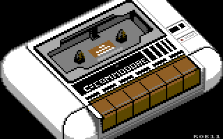
| WOW!!! How nice is that?!! ;) I like every detail of this almost perfect picture! :) |
User Comment
Submitted by Jak T Rip on 17 December 2011
| Love it! a little like the 80's style advert gfx.. |
User Comment
Submitted by enthusi on 28 November 2011
| Nice - and even spelled correctly :) |
User Comment
Submitted by Mantiz on 27 November 2011
| Brilliant. I like it very much this way, with clear sharp lines and as little antialiasing as possible. (would probably be a bit difficult to antialias many areas fully in this picture if keeping to multicolor because of many 8x8 areas use all colors already). Great work, keep it up! :) |
User Comment
Submitted by Skoe on 27 November 2011
| Great, I'll tell n2c about it ;) |
User Comment
Submitted by Moloch on 27 November 2011
User Comment
Submitted by Yogibear on 27 November 2011
User Comment
Submitted by Joe on 27 November 2011
| Nice! Although the lines could have been smoother in the isometric view, I like it a lot! |
User Comment
Submitted by aNdy on 26 November 2011
User Comment
Submitted by Rough on 26 November 2011
This looks good. "Draws" back time.
Quote:Not a fan of tape based software
Now that was another stupid comment, Moloch. +1 |
User Comment
Submitted by Wile Coyote on 26 November 2011
| Upper and Lower border would work wonders. |
User Comment
Submitted by Hoild on 26 November 2011
| Nice! And I agree that the chunky pixel style fits the subject, so no AA is needed. |
User Comment
Submitted by Deev on 26 November 2011
| I hate C64 tape decks, but I quite like this! I've been messing around with isometric graphics a lot lately, so I approve :) |
User Comment
Submitted by Rob on 26 November 2011
phew...
cable and edges will be released in a separated picture!1
;) |
User Comment
Submitted by AüMTRöN on 26 November 2011
| Knew this was gonna be inspired by b-side before looking ;) Nice pic indeed. Bordersprite: yes! Also, where is the cable? :D |
User Comment
Submitted by Rob on 26 November 2011
Open borders, definitely a wise advice. I must admit I didn't take it into consideration - moreover I don't have the technical knowledge to do it, so I would had rather make the pic smaller to fit the 160x200 area...
Anti-aliasing is missing because I wanted to have it in the mood of b-side - http://csdb.dk/release/?id=91617. And also because I'm laaaazy.
|
User Comment
Submitted by Digger on 26 November 2011
| Nice, the author could benefit by using some antialiasing techniques though ;-) |
User Comment
Submitted by chatGPZ on 26 November 2011
| +1 for open borders. looks great! |
User Comment
Submitted by Moloch on 26 November 2011
Not a fan of tape based software, but this is certainly an awesome rendition of the datassette!
I agree about the top/bottom border, open it up and complete the image. |
User Comment
Submitted by Skate on 26 November 2011
| looks so cute. :) it is very suitable to open top/bottom borders and complete the cropped parts. i think you should release a version like that. |
|
|
|
 | Search CSDb |
|
 | Navigate |  |
|
 | Detailed Info |  |
|
 | Fun Stuff |  |
· Goofs
· Hidden Parts
· Trivia
|
|
 | Forum |  |
|
 | Support CSDb |  |
|
 |  |
|


