|
| |
AKA :
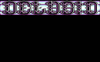
MFC #3 (My First Compo)
Released At :
3-Color-Logo Competition 2013
Achievements :
C64 Graphics Competition at 3-Color-Logo Competition 2013 : #80
Credits :
Download :
Look for downloads on external sites:
Pokefinder.org
User Comment
Submitted by v3to on 23 March 2013
| like the oldschool logo style here. but same as with grass' entry: cga colors. yuk. |
User Comment
Submitted by Shaun C on 18 March 2013
| Interesting intricate design, but i think the colour choice and lack of anti-aliasing hurt it a bit. The sig just hanging out there in the lap of the L is a bit jarring too. |
User Comment
Submitted by Goran on 13 March 2013
| very nice but these logos cannot be used anymore if iam right and thats a pitty. but all good things are always three :-) |
User Comment
Submitted by spider-j on 11 March 2013
nice logo!
so nomistake is to blame for the colors, huh? okay, then I won't critize shine for heavy coder-colors usage... =) |
User Comment
Submitted by Reject on 11 March 2013
phat! i mean, fine outlines man!! Great one, no doubt. kinda prince shine with borax ;)
|
User Comment
Submitted by nomistake on 11 March 2013
ehhmm. oh boy... i am kinda responsible for the color choice... sorry.
|
User Comment
Submitted by Dr.j on 10 March 2013
| Hey Andy , i think you had better logos than this one, but its really okey and different from what we usually see. you know i love you my friend..maybe selection of other colors in the background (texture) could improve it. take it easy :-) |
User Comment
Submitted by iAN CooG on 10 March 2013
|
|
|
 | Search CSDb |
|
 | Navigate |  |
|
 | Detailed Info |  |
|
 | Fun Stuff |  |
· Goofs
· Hidden Parts
· Trivia
|
|
 | Forum |  |
|
 | Support CSDb |  |
|
 |  |
|


