|
| |
Credits :
Download :
Look for downloads on external sites:
Pokefinder.org
User Comment
Submitted by NecroPolo on 16 April 2013
Awesome work, man.
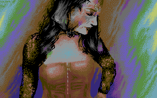
I hear ya, the pose of the girl is the reason for the seemingly strange proportions as this is the exact positions of her hands. But as you imagine her in motion, pic starts to have some depth because of that.
The only thing I'm not sure about is the face shader. Maybe, it worked a little better in the pixels if the upper side of the face has the same colour as the lower part. But maybe not as the shader also adds some depth.
I can't believe no one asked the most important question.
Can I have her number? :) |
User Comment
Submitted by Dr.j on 16 April 2013
| Awesome work . i think you probably had better works but you keep your high level standard. Elenora seems as a nice girl to know... |
User Comment
Submitted by Oswald on 16 April 2013
| I think Leon made the best possible matching the original in hires, maybe it could have been better by changing it some more to suit hires better, but cool job nevertheless. |
User Comment
Submitted by The Phantom on 16 April 2013
I want that background...
Nice work Leon.
I see the imperfections talked about, but don't really care.
Outstanding work dude! |
User Comment
Submitted by spider-j on 15 April 2013
| Mh, okay: the original explains everything. I guess it is just impossible to get this perspective right with plain hires. |
User Comment
Submitted by PAL on 15 April 2013
| man you make such nice stuff, but this time i agree a bit to the recent posters. And also i do not think the texture or fabrick on the arms work that great on the c64 as it make me feel it is more really mumified skin rather than sexy clothing. But hey... you have a uniqe style on these hires stuff, i never seem to produce hires of such quality so that is why i never released one myself in a way... |
User Comment
Submitted by Bitch on 15 April 2013
i agree.
the right breast appears to be slightly bigger than the left and the left arm looks either dislocated or a bit too small. the rest as well as the technique is pretty fucking awesome. |
User Comment
Submitted by spider-j on 15 April 2013
| Great pixel-style as always. But to be honest: proportions look totally wrong. If this was meant to be like this, then I'm sorry that I don't get it. |
User Comment
Submitted by leonofsgr on 15 April 2013
| Her name is Eleonora- I liked her red dress and veil and I thought that it'll be a hard challenge for me to make it in hi-res. I think her hidden eroticism and her body's posture absolutly balanced and harmonic with the attitude of herself and I like'd to keep this beautiful feeling in c64. |
|
|
|
 | Search CSDb |
|
 | Navigate |  |
|
 | Detailed Info |  |
|
 | Fun Stuff |  |
· Goofs
· Hidden Parts
· Trivia
|
|
 | Forum |  |
|
 | Support CSDb |  |
|
 |  |
|


