|
| |
 |
Released by :
JSL
Release Date :
6 August 2013
Type :
C64 Graphics
(MultiColor)
|
Credits :
Download :
Look for downloads on external sites:
Pokefinder.org
User Comment
Submitted by FATFrost on 7 August 2013
| At least you get some feedback.. :/ |
User Comment
Submitted by jailbird on 7 August 2013
| Wow JSL, and this is coming from me: I adore this picture. Really. |
User Comment
Submitted by Deev on 7 August 2013
Do you really think the low average scores are because people don't like you? You were given lots of very useful advice there, in my opinion that's far better feedback to receive than some of the ego massaging comments you can see below. I think it's a shame that there isn't more critique on CSDB. Sometimes people seem to get so touchy about any comment that's perceieved as negative when, in my opinion, constructive feedback from your peers is a great way to improve at any kind of creative activity.
This is a hobby and if you're happy producing the quality of pictures you produce, then you should absolutely carry on doing things as you always have, but you will continue to get mid-range average vote scores. If you want to get higher scores you need to start looking at your work more objectively, listen to all the tips that other people give you and be willing to spend time re-drawing sections of a picture to get it looking good. In my opinion it's better to release 1 great piece a year than dozens of average pieces, but not everyone feels that way. |
User Comment
Submitted by Dr.j on 7 August 2013
User Comment
Submitted by Jak T Rip on 7 August 2013
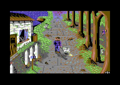
Really interesting picture. Yes, the wrong perspective seems intended, a bit Vetoish how everything spins around the guy and without the black outlines.
Thunbs up! The way of the pixel at pixellation is sure a hard thing to go through, but they also only want to help I guess. |
User Comment
Submitted by Paul Bearer on 7 August 2013
@saimo: erdbeermilch = strawberry milk (shake).
Yep, the perspectives are warped and twisted, but it's a nice colorful picture with a positive attitude. There's a cat, a dog, birds and two little bunnies. I like it. |
User Comment
Submitted by Yogibear on 6 August 2013
User Comment
Submitted by Cobra/Samar on 6 August 2013
| This is one of your best pics |
User Comment
Submitted by Cruzer on 6 August 2013
| I like it, it looks like the wrong perspective was done on purpose. |
User Comment
Submitted by Hein on 6 August 2013
Brave of you to post it at Pixelation. :)
Besides that, *if* you want to improve your skillz, C64 is not the right platform, you'll focus too much on the pixels in zoom-mode. Try some drawing 101 books and use a sketchbook. |
User Comment
Submitted by Matt on 6 August 2013
@JSL
Been reading the comments and I think Saimo hits the nail when he says that this might be a language barrier problem?
Looks like these guys only wanted to give you some hints and tips, no? |
User Comment
Submitted by TheRyk on 6 August 2013
Pity it's unfinished.
Apart from the clearly "wrong" perspective, on the technical side, you coped rather well with a few of your "favourite mistakes"/things people keep criticizing in your pics. Theme ain't bad either, longing for autumn, too, this summer was hot and long enough in Central Europe.
No comment on the drama :) |
User Comment
Submitted by The Shadow on 6 August 2013
| Wow. This is perfect for a game. Very nice :) |
User Comment
Submitted by Oswald on 6 August 2013
| I think it was worth all the extra work, one of your best pics, very nice positive vibes radiating here. |
User Comment
Submitted by saimo on 6 August 2013
@all
The true story is much different - for whoever is interested: http://wayofthepixel.net/index.php?topic=15584.0 (EDIT: the URL at the time of posting was a temporary one; this is the currently correct one).
@JSL
I did my best to help you get into the right mindset to become better. I won't make any further effort, because it will be wasted.
Keep it going like you always did, and your pictures will keep on sucking bigtime. |
User Comment
Submitted by JSL on 6 August 2013
Autumn.. Saimo invited me to Way of the Pixel/Pixelation, I posted there this picture
just because they might give me some tips on what could be better. Just because two
of my contacts said the house is off perspective. To comments on Pixelation, I did
changes to the picture. Some person said the house was after edit Convicibly good.
Now I don't want to get into a fight with these persons there on Pixelation, but
Saimo lateron came with four suggestions to implement in the picture. I didn't want
the redo of the whole picture, and fuck it all up, and said the picture is FINAL. I wasn't
in command, while it was my picture. I had to listen carefully and implement the new
updates. I had to shut up and remove the house and add a new house, I didn't like that.
I had to resize the trees and add smaller trees, I didn't like that. I had to change
the shadows of the trees, I couldn't get them any better. And the tiles on the floor
had to be overdone, while at my point they are smaller in the back, and bigger
on the front, so what is wrong with the tiles.. And Saimo for sure will add a comment
here on CSDb, that I had to listen at Pixelation, and had to update the picture
with these four things, but who's in command over this picture, yes. Not me. And the
thing on fucking up Autumn very hard, with removing all stuff and adding new stuff,
why all this crap work of fucking up a picture, when the results on CSDb are usually
downvotes, and sceners come with "another dull picture by JSL" that I didn't want
to edit the picture anymore, I kept it final. Now with this written comment to this
new picture, Saimo sure will write that Pixelation ain't the thing for me when I
don't listen. Oh, btw. this picture has one thing, which I tried out.. No Black
Outlines. Lateron, Helm and Saimo came with modifications. And I did some updates
to the picture, like the tiles and some other puppet walking there. But still they're
not satisfied overthere on Pixelation. Some dude said when I didn't want to overdo
the house, I had to add an horizon, deleting the last tree and bay, then adding a
sky and sun, then changes had to be made to the shadows etc. - They keep going
with updates, and I.. Made the picture now final. Sure, the house is off perspective,
why everything must exactly be perfect. And when I say there "it is final, no more
changes" they come with "drop your attitude, shut up and listen and implement all
updates the people say to you", why is there no End?
This comment just sounds maybe a bit negative, and they all do a good job on Pixelation,
but I dislike JSL not being in command, and must pixel what they like..
Anyway, enjoy Autumn.. ;-) |
|
|
|
 | Search CSDb |
|
 | Navigate |  |
|
 | Detailed Info |  |
|
 | Fun Stuff |  |
· Goofs
· Hidden Parts
· Trivia
|
|
 | Forum |  |
|
 | Support CSDb |  |
|
 |  |
|


