|
| |
|
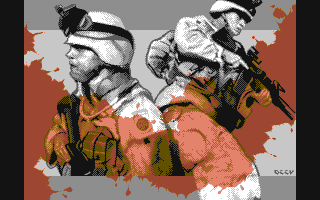
And You Will Know Us by the Trail of Dead [2004] |
Released At :
Breakpoint 2004
Achievements :
C64 Graphics Competition at Breakpoint 2004 : #3
Credits :
Download :
Look for downloads on external sites:
Pokefinder.org
User Comment
Submitted by bugjam on 29 May 2004
| I have to admit that I was one of the "disbelievers" on breakpoint for the, let´s say "unlucky" choice of workstages. So I voted it only on #3 (which on the other hand speaks for the strength of the overall picture, because I hardly vote for any pics that I suspect to be wired/digitized). Would have been by far my #1! 10 points from me, no way around it! |
User Comment
Submitted by Fzool on 14 April 2004
| Great pixel work. But in fact i dont like the motive. |
User Comment
Submitted by Deev on 14 April 2004
| Thanks everyone for the comments! I agree that technically this is not the strongest piece I have done, there are parts that I think look a little messy, but the party was looming and I didn't have time to seriously change things. White -> Light Grey is something I would generally avoid in interlaced modes as it does flicker a little more than I would like, but I wanted to keep the soldiers in greyscale to give the picture a more somber mood and also to make the effect of the red blood all the more powerful. It's also worth mentioning that on my old (breadbin-style) C64, the flicker doesn't seem too prominent as the white is slightly dull and the light grey brighter. I did freak out a little at first when I tested it on a new style C64 over the weekend as the flicker had increased somewhat due to a very bright white! (if you check some of my early pics where this was the only machine I had at the time, you will see I rarely used white at all, for this very reason!) |
User Comment
Submitted by leonofsgr on 13 April 2004
| This is an interesting picture, although it's pretty easy to do... by the way in interlace the white and bright gray pixels flicker on a tv or monitor... hmm... |
User Comment
Submitted by Valsary on 13 April 2004
User Comment
Submitted by jailbird on 13 April 2004
I am absolutely sure that a simple coloring/dithering touch-up wouldn't affect the mood of this picture in any way.
Basically, I'm referring to reducing flickering, smoothing up transitions and putting more "rhymes" into gray and red color-schemes. Even if I didn't asked Deev about this yet, if it was really his major intention to use rudimentary interlaced color-tables/transitions, then he was probably also counting on that the party audience (especially a party like Breakpoint) will not like the picture too much. Sadly, competing on a ultrazupah pop party with a 'motive', is like being the Jamaican bob-sledge team in one person - maybe you'll get lucky and score, but most likely you won't and everyone will remember you only as the moral winner of the race... Deev's tehnical knowledge is on a very high level, but my opinion is that this IFLI could be done better. Only tehnically. Not motive-wise! And it would easily win the compo.
Anyhow, once again I must point out that it is absolutely an excellent composition with outsanding design and motive - but, in it's current phase IMHO it's not a "party breaker picture". |
User Comment
Submitted by Oxidy on 13 April 2004
The simple coloring is imo the strength of the picture. A gray reality colored by blood. Very effective, and Deev did it right.
|
User Comment
Submitted by blackdroid on 12 April 2004
| seriously doing popart of this moody picture would just ruin the intention of the picture, atleast the intention I think deev had for expressing himself with this pic. :) |
User Comment
Submitted by jailbird on 12 April 2004
It was indeed the finest picture. When Deev showed me his work before the compo, I was absolutely sure it will beat my butt hard and get to the #1 spot. I guess it just wasn't colorful and 'poppy' enough for the audience. A part of me is very sad for the underrate of this fab picture, honestly.
On the other side, I think it has some tehnical lacks, especially if I consider that it was done in IFLI, a graphics mode which provides far more possibilities than Deev managed to utilize. IMO, this *could* be a party winner and major eye-candy if more attention was put into coloring and dithering. |
User Comment
Submitted by Optimus on 12 April 2004
| That was my favoritest from the compo! |
User Comment
Submitted by blackdroid on 12 April 2004
| Awesome picture. composition, pixeling, motive.. very nice, my favourite bp'04 compo pic. |
User Comment
Submitted by Oxidy on 11 April 2004
| This is an excellent picture with good composition and colors. You don't have to be a genious to understand Deev's political view regarding the US and their global blood shedding. I normally dont think politics and the scene should be mixed, but I'll look between my fingers this time. I don't know if Deev has reflected on the picture name pun, since Us can be read either as us or the United States. |
User Comment
Submitted by Deev on 11 April 2004
| The zip file contains 4 workstages submitted at the party, the prg is just the executable. |
|
|
|
 | Search CSDb |
|
 | Navigate |  |
|
 | Detailed Info |  |
|
 | Fun Stuff |  |
· Goofs
· Hidden Parts
· Trivia
|
|
 | Forum |  |
|
 | Support CSDb |  |
|
 |  |
|


