|
| |
|
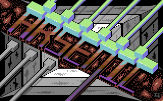
Arsenic Logo "Optical Alignment" [2014] |
Credits :
Download :
Look for downloads on external sites:
Pokefinder.org
User Comment
Submitted by Marq on 14 August 2015
| It might work better without the weird tunnel at the back. |
User Comment
Submitted by slimeysmine on 9 August 2014
| Trippy and really cool, great stuff Shine ;) |
User Comment
Submitted by Dr.j on 8 August 2014
| Great(another) work andy your 3d works reveal your unique style and i adore it |
User Comment
Submitted by ccr on 8 August 2014
Very nice! I like the colour scheme used for all the elements, and the possible reference (if intended) to Paradroid :P
Some more contrast between the letters and the background plasma might've been nicer, but perhaps not easy or possible in plain MC. Or is it plain MC? It looks like the white highlights on the "connectors" might be hires sprite overlay or something? |
User Comment
Submitted by Zierliches Püppchen on 8 August 2014
| Holla, Great Idea. So far your best logo. Good arrangement, fine color management. |
User Comment
Submitted by TheRyk on 8 August 2014
Quite nice!
But someone _has_ to call for antialiasing, so let this someone be me :) |
User Comment
Submitted by dflame on 8 August 2014
| I am always amazed by your pictures ;) |
User Comment
Submitted by leonofsgr on 8 August 2014
brilliant 3d tech. :_)
go go! ! ! |
User Comment
Submitted by The Phantom on 8 August 2014
Nice Andy...
Your work continues to amaze and delight me. |
User Comment
Submitted by Shine on 8 August 2014
| Thanks to Veto for his help and to Joe for his (mental) support! :) |
|
|
|
 | Search CSDb |
|
 | Navigate |  |
|
 | Detailed Info |  |
|
 | Fun Stuff |  |
· Goofs
· Hidden Parts
· Trivia
|
|
 | Forum |  |
|
 | Support CSDb |  |
|
 |  |
|


