|
| |
|
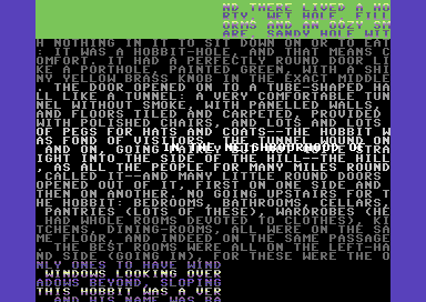
35 Text Lines V2.0 [2016] |
Credits :
Download :
Look for downloads on external sites:
Pokefinder.org
User Comment
Submitted by Rastah Bar on 6 August 2016
Yes, I just looked at it. Super cool demo, as many Crest demos are. It uses expanded sprites with $3fff.
Those vertical border scrollers in Krestage are also great. |
User Comment
Submitted by Tom-Cat on 6 August 2016
"@Digger: is the Crest RHCP done with interlacing?"
Did you even try the demo ? If you did you would see there is NO difference between the lines in the upper/lower border and the normal text lines. So... NO :) |
User Comment
Submitted by Rastah Bar on 6 August 2016
@Joe: play some animation perhaps? Like in Led Board
Cool demo that is!
@Digger: is the Crest RHCP done with interlacing? |
User Comment
Submitted by Joe on 6 August 2016
Nice! Not so overly impressed though, but I've been around long enough to say, I'm bored with interlace modes, regardless what it does ;D
But the tries in border, to give new possibilities, with rasters etc. always gives new thoughts of course, so if you try to change from chars and think about images, what would you do? |
User Comment
Submitted by Chico on 5 August 2016
User Comment
Submitted by Rastah Bar on 5 August 2016
@Jackasser and Digger: Thanks for the suggestion. algorithm also suggested this, but I just wanted to try something different.
Compyx thinks he understands Ken Thompson.
"A person who never made a mistake never tried anything new."
Albert Einstein. |
User Comment
Submitted by Yogibear on 5 August 2016
User Comment
Submitted by Compyx on 4 August 2016
One of my most productive days was throwing away 1,000 lines of code.
-- Ken Thompson |
User Comment
Submitted by Digger on 4 August 2016
User Comment
Submitted by Digger on 4 August 2016
| What JackAsser said. It still flickers a lot, even when you use less luminance difference (by using darker rasterbars), you still turn on/off two halves of the screen. When you do the $3fff chess pattern and X-stretched sprites, the luminance difference is the same but the screen halving is gone :) |
User Comment
Submitted by JackAsser on 4 August 2016
| May I suggest using expanded sprites and do "normal" interlacing instead, but also put them below a $3fff pattern setup in a pixel sized checker board pattern which you also phase shift each frame. |
User Comment
Submitted by Rastah Bar on 4 August 2016
Thanks, guys! I added the changes in background color in the upper border as an experiment. I was just curious about its effect on the flickering.
How about the scroller? Has that improved as well? |
User Comment
Submitted by Mr.Ammo on 4 August 2016
This looks way better on a real machine than the previous version. I must say that the flickering in the upper border is nastier to my eyes than the lower border. In the lower border the flickering is almost not visible for me.
Nice work! |
User Comment
Submitted by chatGPZ on 4 August 2016
User Comment
Submitted by Rastah Bar on 4 August 2016
I tried to hide the flickering from the interlacing by color cycling. IMHO this looks clearly better in emulators than the first version. I don't know how much this improves it on RH.
I fixed a bug in the scroller. |
|
|
|
 | Search CSDb |
|
 | Navigate |  |
|
 | Detailed Info |  |
|
 | Fun Stuff |  |
· Goofs
· Hidden Parts
· Trivia
|
|
 | Forum |  |
|
 | Support CSDb |  |
|
 |  |
|


