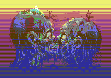
|
| |
Released At :
Revision 2021 Online
Achievements :
Mixed Graphics Competition at Revision 2021 Online : #8
Credits :
Download :
Look for downloads on external sites:
Pokefinder.org
User Comment
Submitted by Electric on 18 December 2023
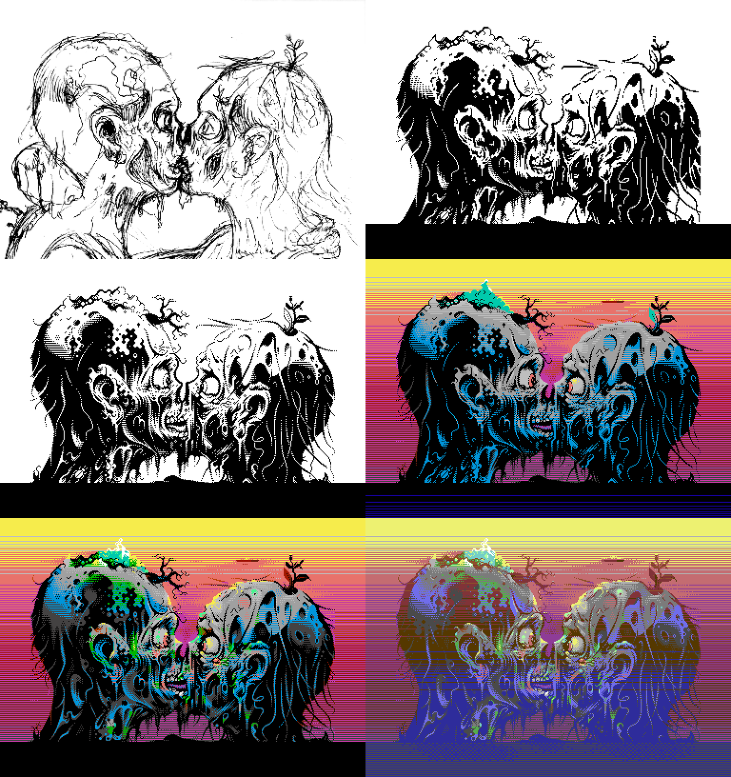
Based on an image drawn on paper that was used as the cover of my comic mag Future#7:

The image was made into pixels with PhotoShop and turned out to be some what different from the original. This pixel version was as well published in print in my book 'Cracking' released in seven languages 2021.
Workstages:
 |
User Comment
Submitted by Bob on 14 April 2021
User Comment
Submitted by Digger on 7 April 2021
| Agree with Electric: kissmet_workstage_07.png is perfect already. Less is more! Great work none the less! |
User Comment
Submitted by grip on 6 April 2021
| Bloody hell. Masterpiece! |
User Comment
Submitted by Electric on 6 April 2021
| Flotsam, note that in the borders I've been able to mix the colours freely and tried to search colour pairs that'd produce 'new tones' - with a closer look it might look like there are a couple of colours out the C64 palette. However, in the dark tones in the screen area we have badlines every 8th line so this free mixing was not possible (read every 8th line there's a 'double line' with same colour on two lines). So, improvised result might sometimes mean I've just been hiding the disabilities :) |
User Comment
Submitted by Flotsam on 6 April 2021
User Comment
Submitted by rail slave on 6 April 2021
User Comment
Submitted by Suckho on 6 April 2021
User Comment
Submitted by MCM on 6 April 2021
| Just WOW !!!! Straight 10/10 !!! Great art !!!! |
User Comment
Submitted by Exocet on 5 April 2021
User Comment
Submitted by Copyfault on 5 April 2021
Thanks for all your positive comments! They really compensate for the c64-colour-distortion during the revision stream (kinda unfair to literally "bash" a whole system this way if you ask me).
@Norvax: thanks for praising the renderer. If there's interest I can write up some details about it.
@hedning, Leon: I used the "new" sync method with an SHX-opcode so I very much suspect this thing to cause problems with "older" emulators.
@Electric: no reason the feel sorry for anything! It was really great to work in collab with you on this; as said to you before, it just felt like in the old MekkaSymposium-days where Easter was all about c64&demoparty :)
@awsm: actually the scent of impossibility was the reason to start working on it;) |
User Comment
Submitted by Stakker on 5 April 2021
User Comment
Submitted by Chico on 5 April 2021
User Comment
Submitted by leonofsgr on 5 April 2021
User Comment
Submitted by Electric on 5 April 2021
| Works fine with my version of Vice (latest). |
User Comment
Submitted by Electric on 5 April 2021
Leon, it is hires, with laced sprite layer on, as stated in the mode. More detailed info below in my 1st comment. This is the hires layer: http://www.boingbeing.com/temp/screen_area_with_signature_3.png
Spinball, I did not remember that Witkin's photo that was used in PS's cover. I do have that one on tape somewhere stil though :). The sketch that I used was done indeed for a magazine cover for my 'Future' comic series, for it's 7th issue that'll be out in August. Will post a preview of that here when out so you can compare the inked version with the C64 one – went their own ways I can tell. |
User Comment
Submitted by leonofsgr on 5 April 2021
| Great picture, but not work vice and not hires. |
User Comment
Submitted by Spinball on 5 April 2021
| Fantastic Pic. The motive reminds me of the Been Cought Buttering Cover from Pungent Stench. Anny connection or just pure coincidence? |
User Comment
Submitted by Brush on 5 April 2021
User Comment
Submitted by awsm on 5 April 2021
| Electric, I'm really sorry but I have to inform you that a picture like this is not possible on the C64. |
User Comment
Submitted by Electric on 5 April 2021
| Jammer, it's very likely that some of the earlier states 'd have worked better. I tend to overdo my images and that especially happens with pixeling, where you're mostly 'deep in the shit' all the time, zooming in and working on details, checking colourclashing and all that. Anyway, for this mode I had couple of motives: to be able to mix colours and to have more details than C64 pics usually, both which Kissmet and Scene Farts test. |
User Comment
Submitted by Jammer on 5 April 2021
| Both technical and artistic jawdrop :O I also totally loved one of earlier workstages ;) |
User Comment
Submitted by Madhead on 5 April 2021
| This was one of those genuine "wow" moments. How can this be done by a human being? |
User Comment
Submitted by Norvax on 5 April 2021
| Another beautiful piece of art from Electric boosted up by copyfault’s creative renderer. It should have taken a lot of patience to make this right. Congrats to both Electric and CF. |
User Comment
Submitted by katon on 4 April 2021
User Comment
Submitted by Flex on 4 April 2021
User Comment
Submitted by Mikael on 4 April 2021
| Really cool Tommi, you keep pushing it, in a very interesting direction! Excellent work here! |
User Comment
Submitted by Electric on 4 April 2021
| Sander, aimed to use the rasters to mix some 'new' tones & make the wholesome look bit different with its palette. We were kind of raffling between of black sprites and sprites with rasters and ended up with the latter. It's a test (once again) somehow, but at least one quite rarely sees a C64 pic without any black in it :) |
User Comment
Submitted by Sander on 4 April 2021
| Great, i love the colors! |
User Comment
Submitted by Morpheus on 4 April 2021
| Super awesome Mr E - again! |
User Comment
Submitted by celticdesign on 4 April 2021
User Comment
Submitted by Joe on 4 April 2021
User Comment
Submitted by hedning on 4 April 2021
PAL: Works fine on real hw and Vice 3.4 (tested now), so all is good. Funny that it won't run on Vice 2.4 or 3.1 (win10), though.
And yes: AWESOME work. Really great pic! |
User Comment
Submitted by Electric on 4 April 2021
Thanks for the comments.
I agree what The Sarge says. This was not really an easy image to prepare either, especially when we don't have any real 'editor' to work on the mode. We as well tuned the mode from 'Scene Farts' image with rasters in the sprite layer as well.
I'm especially sorry for CopyFault as he put a lot of his Easter into this. We got the image uploaded 12 mins before the deadline yesterday and there was a lot of last day/hour/minute fixing. |
User Comment
Submitted by Electric on 4 April 2021
I noted the Revision staff to show the preview in case they could not support fully the lace. Did neither. Additionally all C64 entries seemed to have really bad colours, like Raistilin already mentioned.
Anyway, using lace in gfx compo is always a risk. This was not the first time it all fucked up. Indeed the last time was at Zoo'19 that I was partly organizing :) |
User Comment
Submitted by The Sarge on 4 April 2021
This is such a great picture Electric! Sadly it was ruined on the Revision stream. All C64 pictures was shown with wrong colours, muddy and overall strange looking. It is not acceptable when we are spending so much time perfecting every pixel and colour to have it destroyed on the stream like this. Its not hard to get it right.
Very annoyed. |
User Comment
Submitted by PAL on 4 April 2021
| This is seriously great and the .prg file work here. What a beautiful picture you have created. RESPECT! |
User Comment
Submitted by hedning on 4 April 2021
| I can't get the executable to work. Am I the first one to notice? Maybe that was the reason they had a hard time at Revision? |
User Comment
Submitted by Carrion on 4 April 2021
amazing pic! A winner of course even with the Amiga pics that it competes with!
and what Raistlin said. Whoever did the "real C64" capture should be ashamed of his job. I think Truck mentioned the capture was done on Ultimate 64 - but it's bad capture. |
User Comment
Submitted by Titus on 4 April 2021
| awesome picture - these colors on the stream have been unsatisfying nasty. |
User Comment
Submitted by Electric on 4 April 2021
| Forgot to mention: the zip here contains a lot more workstages compared to what Revision stream showed, starting from pencil sketch and ending to pixeled version and final emulation preview. |
User Comment
Submitted by psych on 4 April 2021
User Comment
Submitted by Raistlin on 4 April 2021
VERY cool! Sadly Revision's C64 colours were borked again - spoiling the live show - they really need to get their C64 setup fixed.
Totally love this pic - and, Truck, you're wrong .. the rasters add so much to this when your colour setup is working. |
User Comment
Submitted by Shine on 4 April 2021
E X T R E M E L Y WELL DONE! WOW!!! <3
I have the feeling, that i didn't see a picture like this on the C64 before. :D |
User Comment
Submitted by Electric on 4 April 2021
To be more specific, that's CopyFault's tuned mode with hires image on the bottom and laced sprites on top (the 'dark colours’). Additionally sprites do have inside rasters, borders some as well. And if this was not enuff, there are some sprites in upper and lower borders. Thanks to CF again for the patience when putting this together.
Just note to myself: never put a laced image in a streamed compo :) |
|
|
|
 | Search CSDb |
|
 | Navigate |  |
|
 | Detailed Info |  |
|
 | Fun Stuff |  |
· Goofs
· Hidden Parts
· Trivia
|
|
 | Forum |  |
|
 | Support CSDb |  |
|
 |  |
|


