|
| |
|
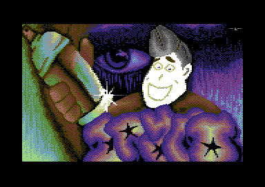
Draco Graffiti Logo [2010] |
Credits :
Download :
Look for downloads on external sites:
Pokefinder.org
User Comment
Submitted by FATFrost on 9 February 2010
| hmmm, that spraycan looks like a cock with a nipple stuck too it.... |
User Comment
Submitted by The Shadow on 9 February 2010
| The overall picture looks nice. The superhero's face looks unfinished. This looks like a collage of art from different people. |
User Comment
Submitted by pvcf on 8 February 2010
nice work, BUT: the spraycan and the logo are "comic" styled and the eye in the background is "real" styled, so the overall impression is "strange", didn't fit together. very very very nice colorworks overall. a shame that the face isnt finished.
not possible to give a rating; the spraycan, logo and background is worth 9/10 or 10/10, also the eye itselfs is very well and should even high rated. but tha composition of wtite scribbled face and the real and comic mix fucks up the whole impression ;( |
User Comment
Submitted by The Phantom on 8 February 2010
The purple looks like the logo in question. Looks to say Draco, could be very wrong (mostly am)
Nice approach.. Love what's going on in the background.. beautiful! |
User Comment
Submitted by PAL on 8 February 2010
User Comment
Submitted by Yazoo on 8 February 2010
| the left side with the spray can looks more polished compared to the guys face. the background (with the eye) is also nice. the logo is completely unreadable - but i guess thats as it should be eventually. |
|
|
|
 | Search CSDb |
|
 | Navigate |  |
|
 | Detailed Info |  |
|
 | Fun Stuff |  |
· Goofs
· Hidden Parts
· Trivia
|
|
 | Forum |  |
|
 | Support CSDb |  |
|
 |  |
|


