|
| |
AKA :
CartPC, CPC
Website :
http://www.arkanixlabs.com/cartographpc.php
Released At :
ECCC Chicago Expo 2010
Credits :
| Code | .... | Warlock of Arkanix Labs, Retro64 |
| Graphics | .... | Moloch of Arkanix Labs, Armageddon, Driven Staff, Retro64 |
| | | Warlock of Arkanix Labs, Retro64 |
| Docs | .... | aNdy of Arkanix Labs, FunkScientist Productions, Retro64 |
| | | Moloch of Arkanix Labs, Armageddon, Driven Staff, Retro64 |
| | | Warlock of Arkanix Labs, Retro64 |
| Test | .... | aNdy of Arkanix Labs, FunkScientist Productions, Retro64 |
| | | Fuzz of Arkanix Labs, Pseudo-soft Works, Retro64 |
| | | Moloch of Arkanix Labs, Armageddon, Driven Staff, Retro64 |
| | | Warlock of Arkanix Labs, Retro64 |
Download :
Look for downloads on external sites:
Pokefinder.org
User Comment
Submitted by Moloch on 22 September 2010
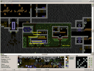
The datamap is a large file while a work in progress. Once you export the datamap it will shrink down to the dimensions you originally set it at. It's a workspace for your project basically.
We're toying with the idea of adding the ability to save full, half, and one fourth of the tileset for V2.5
|
User Comment
Submitted by Carlos on 20 September 2010
Great upgrade but some suggestions:
- Include a grid in the tile editor area and in the datamap area. This would make things easier.
- The .chr tileset saved file always is 2K (2048 bytes) large regardless the number of defined characters (would be nº of chars * 8 ).
- The same with the datamap file, why is this file 32K large for a 40x25 map?
can't wait for the V2.5 release ;) |
User Comment
Submitted by Moloch on 20 September 2010
The two machines I've used CartographPC on run at 1920x1200 (laptop) and 1920x1080 (this desktop) and neither have an issue with distortion of text in the Settings window. Maybe you could post an image of the problem?
We'll discuss the idea of a larger display, but there are no promises. I'll mention the background color idea also.
|
User Comment
Submitted by TWW on 19 September 2010
Sorry didn't read ny roadmap but it's good to see such fine suggestions already planned.
II'm currently running in 1920x1080 which is the recommended setup on my laptop (i.e. makes my eyes hurt less). This distorts some of the text in the Option Window (but as you say, It could be something funny about my setup?!). But I'm telling you, 200% zoom would be great. As it is now I either have to use a magnifying glass or change screen resolution (which is a drag honnestly).
I still think CTRL+C isn't a good choice for clearing.
Which leaves one thing: Collor background changing. A really importaint feature (you didn't comment on it so it might already be implemented). |
User Comment
Submitted by Moloch on 19 September 2010
I guess you didn't actually check out the program or check the "Roadmap to V2.5"?
- cut/paste has been in since V1.5
- we test on all sorts of setups, medium to hires screens and it's fine the way it is, don't see a reason for zooming in further
- "multicollor" support is in V2.5 (roadmap)
- tile animation is in V2.5 (roadmap)
- your system must have a problem, my test systems are 16:9/16:10 screens and options screen is fine
We appreciate the feedback, but a little bit of looking around first would be beneficial to making your feedback worthwhile. ;)
|
User Comment
Submitted by TWW on 19 September 2010
Good potential to become the ultimate char-map editor. however:
Suggestions for improvement:
Cut/copy/paste/blockmove for the tiles & map
Support more zoom then 100% (Some of us gotz rezolutions)
Your contact adress is missing country :)
Choice between hi-res / Multicollor(!!!)
tile animation
posibility to change background collor.
right click on map = erase tile on map
ctrl+c = bad choice for clear screen^^
Bugs:
The option window is messed up on my display (widescreen 16:10 or whatever). But heck it so does VICE.....
thats it for now cheers! |
|
|
|
 | Search CSDb |
|
 | Navigate |  |
|
 | Detailed Info |  |
|
 | Fun Stuff |  |
· Goofs
· Hidden Parts
· Trivia
|
|
 | Forum |  |
|
 | Support CSDb |  |
|
 |  |
|


