|
| |
Released At :
X'2010
Achievements :
C64 Graphics Competition at X'2010 : #5
Credits :
Download :
Look for downloads on external sites:
Pokefinder.org
User Comment
Submitted by katon on 13 March 2023
User Comment
Submitted by v3to on 18 October 2010
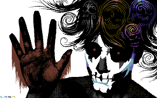
| excellent stuff. straight forward, good use of hires and striking color concept. |
User Comment
Submitted by Medicus on 10 October 2010
| Top notch... it took me some time to appreciate it. Especially the hair... brilliant. I assume it only ended up 5th cause it was not shown too long on the big-screen. |
User Comment
Submitted by booker on 10 October 2010
| A serious kickass to me. Would like the blood to go from the very top down to the hand but.... And aha, the skulls in the hair (also these barely visible to be the skulls) - top notch! |
User Comment
Submitted by Deev on 8 October 2010
| Love it, definitely one of my personal top 3 in this competition. |
User Comment
Submitted by FATFrost on 7 October 2010
User Comment
Submitted by hedning on 7 October 2010
| My absolute favourite in the compo. Excellent! |
User Comment
Submitted by Sander on 5 October 2010
Fantastic picture - pretty sure this is Louie's own design aswell. So much style and it's such a carefully considered piece. Some dithering turns me down a bit, but the rest completely makes up for that.
One of the best in the compo. Thanks for the chats too, it was nice meeting you. |
User Comment
Submitted by Moloch on 4 October 2010
| Fantastic work, reminds me of a movie or two I've seen recently. Well done! |
User Comment
Submitted by Wile Coyote on 4 October 2010
| The hand against glass with blood works really well. |
User Comment
Submitted by Akira on 4 October 2010
User Comment
Submitted by Hoild on 4 October 2010
| What Saehn said. Cool piece! |
User Comment
Submitted by saehn on 4 October 2010
| Wow, I'm glad and surprised that this one placed so well... because it's not what I'd expect would appeal to a compo audience. It's more minimalist than many traditional entries, but is very well executed with an interesting theme. And if I were to voice my own gripes, they'd simply be objections to the few unaltered vertical lines that don't flow as well with the rest of the work. But congratulations, it's a keeper. :-) |
User Comment
Submitted by Archmage on 4 October 2010
| In all it's simplicity, this is my favourite from the gfx-competition at X this year. The way of communicating the idea by means of effective use of black and white here is just great. My favourite part is the blue/cyan bit defining the chin and the face itself. My least favourite part of it is the generic dithering of the hand and shoulders. Those are minor gripes, because overall this is a picture that works. |
User Comment
Submitted by Motion on 4 October 2010
| Mind blowing - powerful stuff! |
|
|
|
 | Search CSDb |
|
 | Navigate |  |
|
 | Detailed Info |  |
|
 | Fun Stuff |  |
· Goofs
· Hidden Parts
· Trivia
|
|
 | Forum |  |
|
 | Support CSDb |  |
|
 |  |
|


