|
| |
AKA :
Don't forget compo within compo ;)
Released At :
Plain PETSCII Graphics Competition 2013
Achievements :
C64 Graphics Competition at Plain PETSCII Graphics Competition 2013 : #66
Credits :
Download :
Look for downloads on external sites:
Pokefinder.org
User Comment
Submitted by Jak T Rip on 15 October 2013
| Not bad at all, but too easy as it doesn't use any "real" characters :) |
User Comment
Submitted by Mermaid on 11 October 2013
| Hah, I knew Hedning would write something like that. Nice picture! |
User Comment
Submitted by TheRyk on 10 October 2013
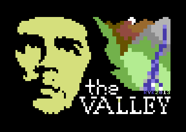
This is not really meant to be a serious entry, mainly a reminder for the compo-within-compo by G*P. Far from Grade A (even if measured by the limits of my own skills). Thx for liking or not-liking it, anyway. Maybe gonna label it "out of competition" if I find time and inspiration to create 2 or more better entries ;)
Edit: This is not meant to be disrespectful like "I don't take the competition seriously" (do I?), if I not only 'worked' but afterwards even looked (b:stared) at a picture for hours and like it and don't see any way to make it better anymore, I rather release than totally spoil it :)
Took me an evening plus an afternoon. Of course, I'm aware that using only 14(?) characters and calling it PETSCII is debatable, cf. The Call from Beneath and frowned upon by some ppl. I already showed in the other release that I _know_ how to hit other keys. But this time, the motive simply indicated blockiness, at least to my mind. My own mother created posters and flags with good old Ernesto some 40 years ago, I painted myself as Che after buying Rage Against The Machine's Bombtrack some 20 years ago... So I simply was longing for doing Che on C64 :)
Realising the face in that 80x50(?) resolution ain't that hard, did the like before in Waste of RAM (still very stupid, without any technical help, all handmade) and the intro to Telengard V5.2 permadeath (this time, after Veto gave me some advice, a little more cleverly). Believe it or not, not only does hand-PETSCIIing take some time, but the "calculated and hand-PETSCIIed" result also always(!) needs some hours effort in order to get the facial expression you want :)
btw I had a version with black outline dithering of background which took me a couple of hours but which was finally dumped because I thought it would be better to let the background look even more LowRes than Che himself - and the outlined version simply looked a great deal more shitty than this "blocky-color-clashing" one :D
WAY More than nuff said! Let's talk about politics. Triad are Commies!? Yeah so! What an excellent group :)
Edit: yeah, the logo... should(!) resemble a broken/old typing machine as on the Rage Against The Machine cover... realised rather so-so imho... ;) |
User Comment
Submitted by hedning on 10 October 2013
| Well executed, indeed, but would fit the commies in Triad better. ;) |
User Comment
Submitted by The Shadow on 10 October 2013
|
|
|
 | Search CSDb |
|
 | Navigate |  |
|
 | Detailed Info |  |
|
 | Fun Stuff |  |
· Goofs
· Hidden Parts
· Trivia
|
|
 | Forum |  |
|
 | Support CSDb |  |
|
 |  |
|


