|
| |
|
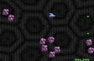
Teradyne Warrior Preview [2007] |
AKA :
Terradyne Warrior
Released At :
Game Over(view) Freestyle Jam
Achievements :
C64 Game Competition at Game Over(view) Freestyle Jam : #5
Credits :
SIDs used in this release :
Download :
Look for downloads on external sites:
Pokefinder.org
User Comment
Submitted by The Shadow on 11 July 2011
| Wow cool as hell! I am so looking forward to the completion of this game :) |
User Comment
Submitted by d0c on 24 January 2009
| yes please finish this game.... |
User Comment
Submitted by Heavy Stylus on 9 January 2009
| Please finish this! My C64 needs it! |
User Comment
Submitted by Steppe on 17 October 2008
| Any news on this? I was sooo hoping that the game would be finished or extended some day... :-( |
User Comment
Submitted by Jak T Rip on 3 February 2007
Ho, CJam! You tend to pop up from time to time and surprise me with your skills.
This game looked like often-seen crap on the screenshot, but is way above that ranking.
1) *very* cool background effect
2) enjoyable gameplay! That's rare. The objects are repetitive and its no wonder the game looks unfished as it IS unfinished :) But the gameplay is already quite nice - the enemy movements are indeed surprising and won't bore, plus the difficulty level rises in an appropriate speed.
You have the ability to add this special invisible fine tuning to a game that makes it worth to play - congratulations! btw, if you would like to work on a similar and partly finished game, drop me a PM! |
User Comment
Submitted by Richard on 30 January 2007
| I have played this game on my real C64. I originally though that this was going to be an asteroids clone. Proves me wrong. The game has a nice background effect and is superbly playable. I'd love to see more variation in the full game :) Nice work. I love that scroll effect :) |
User Comment
Submitted by AüMTRöN on 29 January 2007
Crazy background effect. Prerendered I guess, but I still dont get it... Must be charset splits, right?
Anyway, +1 on more levels (more backgrounds), more formations, better title screen :), etc... Was very impressed by this... cool game - good work! |
User Comment
Submitted by The Overkiller on 29 January 2007
| You pointed out nice ideas to expand it, good work for the 1.2v, ChristopherJam. |
User Comment
Submitted by daison on 29 January 2007
Very cool background! It made me anxious for more levels to see other kinds of bg fx.
I think you should 'finish' it.
Tnx! |
User Comment
Submitted by ChristopherJam on 28 January 2007
Aargh - can't believe I misspelled the game on the title screen. Well spotted, The Overkiller. As you can probably tell, it was only meant to be a placeholder while I worked on the actual game. My better half actually queried the spelling when I was doing the database entry - I didn't realise where she'd gotten the impression it was spelled differently.
Now I'll definitely have to do a 1.2 ;-) And yeah, with also in-game music, more formations, another bug-fix...
Scout; I agree it's not the best entry in the compo - as soon as I realised Samar were putting something in I suspected the competition would be pretty strong. Note to self - allow more time for polishing! |
User Comment
Submitted by RaveGuru on 28 January 2007
| Wow! This is really well done in just 3 weeks! Can't imagine what this would have looked like with some more development. How about a "full" version? I love this kind of shmups! |
User Comment
Submitted by Steppe on 28 January 2007
| That background animation is really wicked, man! The game plays very well, and I'm all for extending it, if your time allows, ChristopherJam! |
User Comment
Submitted by d0c on 28 January 2007
| this looks very nice and plays very good, but it feels a bit unfinished... i hope you will continue to develop this game, it sure is worth it :) |
User Comment
Submitted by Scout on 28 January 2007
Yes, this game is a bit unfinished.
It has a end of level/game boss but after that the game starts from the beginning.
This compo has better entries (imo). |
User Comment
Submitted by Twoflower on 28 January 2007
| The game is somewhat repeative, thanks to reusage of similar attack patterns, but don't think that it wraps anywhere early. This is a really nice game which would have benefitted from some nice stuff around it (really spiffy titlescreen and driving ingame-tune). Hope to see a version 1.2. |
User Comment
Submitted by Sixx on 28 January 2007
User Comment
Submitted by The Overkiller on 28 January 2007
| But it's Teradyne or Terradyne ? Also I quote Skate here, more add-ons should be appreciated. |
User Comment
Submitted by Skate on 28 January 2007
| Nice background animation and multiplexer. But game looks incomplete. |
|
|
|
 | Search CSDb |
|
 | Navigate |  |
|
 | Detailed Info |  |
|
 | Fun Stuff |  |
· Goofs
· Hidden Parts
· Trivia
|
|
 | Forum |  |
|
 | Support CSDb |  |
|
 |  |
|


