|
| |
|
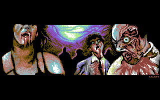
New Zombie-Movie Trailer Screenshot [2011] |
AKA :
First pic in 2011 (the name is a joke! ;_)
Credits :
Download :
Look for downloads on external sites:
Pokefinder.org
User Comment
Submitted by Joodas on 22 July 2018
| Just found this picture! Awesome, clean and beautifull:) 10 from me. |
User Comment
Submitted by Axess on 26 January 2011
| I like the widescreen and the details; much better than the fullscreen version... |
User Comment
Submitted by aNdy on 14 January 2011
| Love Zombie stuff, love this! Class! |
User Comment
Submitted by endo on 14 January 2011
User Comment
Submitted by NecroPolo on 14 January 2011
Awesome!
That would make an excellent intro screen for a zombie-survival C64 game :) |
User Comment
Submitted by SplAtterpunk on 14 January 2011
| Living dead, that's what I like :) I'd love to see more of Leon's zombie pics in other graphic modes as well. |
User Comment
Submitted by Joe on 14 January 2011
User Comment
Submitted by DeeKay on 14 January 2011
| Wow, very very nice, Leon, probably your best Multicolor pic so far! It seems to me that you brushed up a lot on your detailing kung-fu, it almost looks like Archmage, one of the masters of MuCo-detail! ;-) |
User Comment
Submitted by Cresh on 14 January 2011
| That guy in the middle looks like Palikot! ;) |
User Comment
Submitted by Wile Coyote on 14 January 2011
Great theme! - the woman on the left looks realistic, while the zombie to right more cartoony.
@JackAsser - heh, funny little film.
Return of the Living Dead 5%
features some frames from Zombie Flesh Eaters
|
User Comment
Submitted by JackAsser on 14 January 2011
User Comment
Submitted by FATFrost on 13 January 2011
| no, no problem bro... i love your pic, i was just pointing a piccy i found, i think yours looks better than original... hahahhaha...... at least you don't pretend yours is real like others do.... (+_+) |
User Comment
Submitted by leonofsgr on 13 January 2011
| fatfrost: it is 100% copy? I do not think .... anyway this is the problem? I do not understand ... |
User Comment
Submitted by Steppe on 13 January 2011
User Comment
Submitted by Cybortech on 13 January 2011
| the screenshot is Pepto-palette? |
User Comment
Submitted by Ragnarok on 13 January 2011
User Comment
Submitted by Stainless Steel on 13 January 2011
Very good. <3
I just had this weird vision of a disco ball dropping into the picture and heard disco music.
|
User Comment
Submitted by Digger on 13 January 2011
| Top class. Looks bloody good ;-) Nice colour palettes and no FLI needed. Brilliant Leon! |
User Comment
Submitted by Mactron on 13 January 2011
Awesome. I like this horror-stuff.
The Lady in the left looks yummy :D
|
User Comment
Submitted by Raffox|HF on 13 January 2011
Sweet!
I want the rest of the movie now. |
|
|
|
 | Search CSDb |
|
 | Navigate |  |
|
 | Detailed Info |  |
|
 | Fun Stuff |  |
· Goofs
· Hidden Parts
· Trivia
|
|
 | Forum |  |
|
 | Support CSDb |  |
|
 |  |
|


