|
| |
 |
Released by :
Muh
Release Date :
5 April 2013
Type :
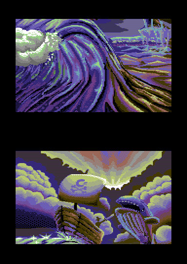
C64 Graphics
(MultiColor)
|
Website :
http://compo.c64pixels.com/doublescreen/entries2013.html
Released At :
C64pixels.com Double Screen Compo 2013
Achievements :
C64 Graphics Competition at C64pixels.com Double Screen Compo 2013 : #3
Credits :
Download :
Look for downloads on external sites:
Pokefinder.org
User Comment
Submitted by NecroPolo on 1 May 2013
| The most unique and stylistic pic among the entries IMO, definitely my fav one from the compo. Plus it is one of the few true original creations from the scratch. Massive respect, man! |
User Comment
Submitted by Almighty God on 7 April 2013
| Very nice scene. looks better in PNG than in a real C64... more work in dithering and anti aliasing needed from my point of view... |
User Comment
Submitted by Bitbreaker on 7 April 2013
"I must get me one of those Yazoo/Pal/Leon/etc photoshop filters."
No need for filters and photoshop-wizardry or alike, you are doing it all right! Just gain more experience and thus save time by applying that experience. Until then give your pics enough iterations until finished :-) |
User Comment
Submitted by Joe on 7 April 2013
| Great work and very inspiring to see the workstages. |
User Comment
Submitted by muh on 7 April 2013
Thanks for the comments. It's basically the first full screen (even double screen) picture i've done. Had fun drawing it. And yes, technique will hopefully improve a bit in time ;)
I must get me one of those Yazoo/Pal/Leon/etc photoshop filters. |
User Comment
Submitted by Yogibear on 7 April 2013
| Another excellent one! God I love this compo! |
User Comment
Submitted by Bitbreaker on 6 April 2013
| Big respect for doing that piece without any references and stuff. It was a pleasure to watch the anigif on c64pixels that show the workstages and progress. I guess it took you already a huge amount of time to finish and still it could need some polishing in some pixels. But isn't that a usual thing hitting allof us, that as soon as something is released we spot some misplaced pixels or glitch produced by our code :-) |
User Comment
Submitted by Shine on 6 April 2013
User Comment
Submitted by Bitch on 6 April 2013
| 10/10, for it's made of love and testicles. |
User Comment
Submitted by Deev on 6 April 2013
| This is my personal favourite from the compo. It's an original piece (which is definitely a lot more difficult to produce) and the dynamic sky and waves are lovely. To those questioning the pixel technique, I agree there are a few chunky edges, but there are a lot of different colours crammed into each char and also some very nice touches, such as the subtle differences in the dark patches of the sky. |
User Comment
Submitted by Flea on 6 April 2013
| What a brave man! Fighting a sperm whale (made me laugh when I translated this well-known for it's head liquid - spermaceti - animal, into English) with such a small sword. I wish he was more noticeable though, being such important part of the pic (nitpicking, I guess). I like the sparks on the waves, great energy, that the picture carries and use of colours. Nice one! |
User Comment
Submitted by redcrab on 6 April 2013
Muh delivers fresh style again! A bit chunky for my personal taste, but I love the colors, especially the cold - warm transition from left to right. More of that please!
One small issue to keep in mind til next time is that mixcolors (most of the sky in this case) will flash when scrolled vertically, due to the fact that blue/brown and brown/blue produces slightly different colors.
Edit: If you use a real screen or at least PAL emulation that is. (and we all do, right?) |
User Comment
Submitted by leonofsgr on 6 April 2013
| one of the best in this competition. like the phases, peculiar use of color, I like it! |
User Comment
Submitted by Sphinx on 6 April 2013
| it´s a really good picture, also one of my favorites! :-) i like most the execution of the clouds and the wave, on some parts of the picture, the pixeltechniques lacks a little bit, thats true... but nevertheless a really nice idea! but i am always asking me: if the boat is a c64-boat, why is the whale hunting for it, hehe? :-D |
User Comment
Submitted by Yazoo on 6 April 2013
| this is one of my favourites in the compo. the overall impression is quite nice and colorful. it maybe lacks a little bit pixeltechnique here and there (just in some parts), but i love the motif, the colors and the energy of the picture. well done muh! |
User Comment
Submitted by psych on 6 April 2013
| Indeed. This pic is full of energy. Great! |
User Comment
Submitted by spider-j on 6 April 2013
| totally awesome! my favorite from the compo. It has great energy, feels like the pic is alive =) |
User Comment
Submitted by FATFrost on 6 April 2013
User Comment
Submitted by The Shadow on 6 April 2013
User Comment
Submitted by dink on 6 April 2013
User Comment
Submitted by celticdesign on 6 April 2013
User Comment
Submitted by CONS on 5 April 2013
| What a wonderful picture this is. Good motif and i like the wave. |
User Comment
Submitted by Clarence on 5 April 2013
| I quite like this, especially after looking at the work stages too. |
User Comment
Submitted by Oswald on 5 April 2013
| great motif & composition, lacks technically. |
User Comment
Submitted by Cruzer on 5 April 2013
|
|
|
 | Search CSDb |
|
 | Navigate |  |
|
 | Detailed Info |  |
|
 | Fun Stuff |  |
· Goofs
· Hidden Parts
· Trivia
|
|
 | Forum |  |
|
 | Support CSDb |  |
|
 |  |
|


