|
| |
Released At :
Intro Creation Compo 2021
Achievements :
C64 Demo Competition at Intro Creation Compo 2021 : #4
Credits :
SIDs used in this release :
Download :
Look for downloads on external sites:
Pokefinder.org
User Comment
Submitted by TheRyk on 22 March 2022
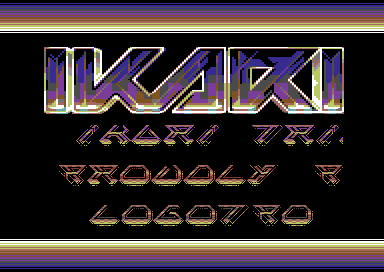
<3 that font
(not to speak of the logo)
also cool scroll/text colour effect, very decent screen, Sirs |
User Comment
Submitted by Jammer on 28 February 2022
| Excellent take on classic Ikari logo <3 |
User Comment
Submitted by HCL on 28 January 2022
Haha, everyone requested an intro for this fabulous logo, but now everyone seems to think it should have been done differently :). I'm looking forward to seeing a bunch of *better* IKARI-intros.. ;D.
That said, i'd better not comment this intro myself.. at least not come with any critisism ;). I could always say: Nice logo! |
User Comment
Submitted by Cupid on 28 January 2022
| @twilight, for sure, but a more line-based rather than checkerboard would work nicer with the style of the logo. Still, cool to see you create so many intros lately. |
User Comment
Submitted by Doc Snyder on 28 January 2022
| Maybe start a intro-for-sanders-ikari-logo compo? ;) |
User Comment
Submitted by grasstust on 28 January 2022
| Like several have pointed out, the elements don't really compliment eachother. I think in a sense something even simpler would have done it. The scroller font is a bit too complex and introduces a new style which doesn't go well with the logo. The raster bars don't really go with the logo either - even if the colours do. In a way it's an interesting attempt. I'd like to see more attempts, cause I'm a nerd for these things. :) |
User Comment
Submitted by Sander on 27 January 2022
| Thanks for providing a pedestal for my logo :) I love the scroll <3 |
User Comment
Submitted by Monte Carlos on 27 January 2022
User Comment
Submitted by Laurent on 27 January 2022
| Nice little intro, love the charset and the amazing logo ! |
User Comment
Submitted by Seven on 27 January 2022
The problem with the colors was that the genius who supplied the original screenshot somehow managed to take JPG screenshots and merge those into a GIF, which fucked up the colors.
Should a release be checked out and not just be judged by screenshot? Yes.
Should people supplying release screenshots know better than to upload totally messed up images? Yes.
That being said, while the logo is freakishly awesome and the charset is quite neat, the screen doesn't really come together. |
User Comment
Submitted by Twilight on 27 January 2022
| i wanted to take something from the old ikari intros and that's why i have the background effect in the text :) |
User Comment
Submitted by Cupid on 27 January 2022
| Cool, but as the logo has no dithering at all and the font is hires it probably would have looked smoother not to have these backgrounds. Nice font and good execution. |
User Comment
Submitted by iAN CooG on 27 January 2022
| People should really stop judging ONLY from a screenshot. The prg is correctly setting the screencolors, and the screenshot now is not anymore a (badly color reduced) gif, which was the only problem here. |
User Comment
Submitted by Wile Coyote on 27 January 2022
Logo, Font look great!
Music sound great!
Raster-bars, hmm.. generic pattern. Given the logo is lit from the bottom, i might have had the lower raster bar lit from the bottom as the top raster is.
The design of the raster-bars could possibly be more inspired by the make-up of the logo. |
User Comment
Submitted by Twilight on 27 January 2022
| what's your problem ? there are no color errors ! it's just like sanders release ! have you ever looked at the logo on real hardware or emu ? |
User Comment
Submitted by Tim on 27 January 2022
Congrats.
You've literally managed to butcher probably the best logo made this year so far :( |
User Comment
Submitted by Digger on 27 January 2022
| The colour RAM init needs to be fixed for the logo, or the screenshot is not accurate. |
|
|
|
 | Search CSDb |
|
 | Navigate |  |
|
 | Detailed Info |  |
|
 | Fun Stuff |  |
· Goofs
· Hidden Parts
· Trivia
|
|
 | Forum |  |
|
 | Info on other sites |  |
|
 | Support CSDb |  |
|
 |  |
|


