|
| |
Released At :
Forever 2015 - Back to the Cyberspace
Achievements :
C64 Graphics Competition at Forever 2015 - Back to the Cyberspace : #1
Credits :
Download :
Look for downloads on external sites:
Pokefinder.org
User Comment
Submitted by Bitbreaker on 18 March 2015
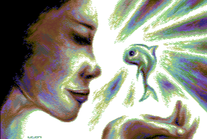
| Face (forehead and eyes need too much in the back, and eyes too high) and susage like fingers do not work for me. i know however that those things are always a bitch if done from scratch, i also need several iterations to have at least an acceptable result, an then still having glitches. |
User Comment
Submitted by Magnar on 15 March 2015
| Leon, sounds like too much plastic surgery operations! :) I like the Picture, and it is very colorful. For improbement input; Maybe the dark hair=black area top left corner just doesnt fit as a black area with all the other shiny colors all over the screen? It might present the Picture as half-finished somewhat. But, the colorful fish is ace, mate! :) |
User Comment
Submitted by leonofsgr on 15 March 2015
| Thank you for your comments. I know the picture is not perfect. It was handmade from own idea and you can be sure that first phases were much worse. I made a lot of corrections. I don't know why it doesn't work, but I find this face ugly either. Eye, mouth, nose all work separately but not together. That's it, next will be better! ;_) |
User Comment
Submitted by Yogibear on 15 March 2015
User Comment
Submitted by Sith on 15 March 2015
| Leon, you might want to ask a girl in your environment to take that pose and make a pic of it to give you an idea what you should be aiming for when drawing. It will give you an idea of the anatomy and dimensions in such a pose. You don't need to use all colors like this so frequently. It endangers your images from getting samey color schemes. The things Jammer linked here perfectly show that you can get awesome results with different color set ups too. |
User Comment
Submitted by PAL on 15 March 2015
| Again, the fish is so cute! The rest of the image is not that good... sorry.. it is a lame no sexy chick and a distorted hand... I really said in the first comment on this what was worth saying... The fish is cute and could be a movie superstar if animated and all... cool to see your images. |
User Comment
Submitted by bepp on 15 March 2015
User Comment
Submitted by nice on 14 March 2015
| ... which is somewhat disturbing for me, sorry. |
User Comment
Submitted by nice on 14 March 2015
| All the distinct objects (face, hand, background, fish, lighrays) are equally colorful but without each one having its own dominant color, and because of this, the resulting color cavalcade is somehow rendered as nearly greyscale by my brain :-( |
User Comment
Submitted by Joe on 14 March 2015
I have a very personal rendition/sketch, where the circulating light around the fish are happy killer dolphins, but that's another story...
Still like your darker thing more though, but do enjoy the brightness in this. |
User Comment
Submitted by TPM on 14 March 2015
| like everyone already said.. the fish is cool. The rest? I'm sorry.. don't like the hand and the face. I've seen better from you, Leon. |
User Comment
Submitted by HCL on 14 March 2015
| Dude, these are *my* favourite 16 colors as well :P. |
User Comment
Submitted by Sith on 14 March 2015
| Thx Jammer. I've seen some different ones from Leon, breathtaking as always, but these specific colors here seem to be his favorite. |
User Comment
Submitted by Jammer on 14 March 2015
User Comment
Submitted by Inge on 14 March 2015
| What Hedning said. Very cute fish! |
User Comment
Submitted by Sith on 14 March 2015
| Fish is really cute! I'd love to see a different color scheme from you though. |
User Comment
Submitted by Tch / Brutal on 14 March 2015
| Love the usage of blue. Great pic! |
User Comment
Submitted by GeoAnas on 14 March 2015
User Comment
Submitted by Dr.j on 14 March 2015
User Comment
Submitted by hedning on 14 March 2015
| Fish is awesome!!11. Proportions of the womans face is a bit awkward, though. |
User Comment
Submitted by PAL on 14 March 2015
|
|
|
 | Search CSDb |
|
 | Navigate |  |
|
 | Detailed Info |  |
|
 | Fun Stuff |  |
· Goofs
· Hidden Parts
· Trivia
|
|
 | Forum |  |
|
 | Support CSDb |  |
|
 |  |
|


