|
| |
AKA :
Avatro v1.0
Credits :
SIDs used in this release :
Download :
Look for downloads on external sites:
Pokefinder.org
User Comment
Submitted by plagueis on 15 September 2014
| Fucking spectacular, and by that I mean great! |
User Comment
Submitted by Rough on 11 September 2014
| @The Ryk: AVATAR PRESENTS THE OPENING SCREEN OF THE COMMODORE 64 press space to continue |
User Comment
Submitted by Rough on 11 September 2014
| I guess The Shadow is thinking about what to do against the next conspiracy theory his facebook friends post him :D |
User Comment
Submitted by hedning on 11 September 2014
| Should be sorted under "intro" then, until Avatar uses it. Not "Crack Intro". |
User Comment
Submitted by TheRyk on 11 September 2014
| Dr Strange: from a philosophical/ nitpicking point of view I never understood releasing intros without anything they introduce to after press space pointless. In this case, I'd just call them demos untill really used in front of crack or whatever other stuff :) |
User Comment
Submitted by Doc Strange on 10 September 2014
| Phantom/Elk: Don't get me wrong guys, I just think that new intros should be used for their own specific purpose: sit in front of a crack. However I understand that Phantom didn't want to wait ages before seeing his work published. |
User Comment
Submitted by Yogibear on 10 September 2014
User Comment
Submitted by The Phantom on 10 September 2014
@Dr.J... Relax bro... I hope I don't seem like I'm attacking anyone here, not the case at all. Blame it on lack of talking to humans ;)
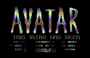
Dr.J, The overall complexity of the logo isn't realized. Where there should be anti-aliasing, there are raster lines. I likely didn't do my coloring as well as I could have. If you look really close, you should be able to see the raster lines, but know I tried HARD to hide them.
The ORIGINAL version of the logo is used in the first intro draft. It also uses a never-before seen routine. I didn't release that version because no intro should be over 124 blocks. The Shadow was fine with it, but I wasn't.
The music and plasma are not working together, just coincidence. |
User Comment
Submitted by TheRyk on 10 September 2014
PS/BTT: logo could need some polish/anti-aliasing
what I like is the plasmoid black in the bottom lines which at least seems to behave in the rhythm of the music, maybe just coincidence or an illusion but well-done |
User Comment
Submitted by ϵʟʞ on 10 September 2014
..Submitted by Dr.Strange [PM] on 10 ..September 2014
..It's a pity to release a new intro before an official release
But it is not made by Avatar members - just by a fan of our group!
Thank you The Phantom! Seems good but we with DKT is working on another one already! And not true that we are using the only 4.5 years old intro :) But why to change what is perfect yet ;) |
User Comment
Submitted by TheRyk on 10 September 2014
haven't heard anything from andy for half a year or so either, though he was eager on a fixed/optimized version of my old intro including source, which made me expect some cracks in 2014.
At least Phantom reminded us that ATA still might be around, which can't be a bad thing I guess, just as iAn said, give them time :) |
User Comment
Submitted by Dr.j on 10 September 2014
| @The Phantom: not that i think its a bad logo but somehow Lack of uniformity of the colouring a bit bother me , also the white outlines of the logo that i better prefer not to show it (for me a sign of a stantdard ). again Eric , its a matter of choice , pls not take it too hard, and btw i wrote i like the music :-) |
User Comment
Submitted by iAN CooG on 10 September 2014
avatar took 4.5 years to use this intro: Brand New Intro
so you have to be patient with them, it will be used, sooner or later :D |
User Comment
Submitted by The Phantom on 10 September 2014
@Dr.Strange - It is a pity. It's also a pity when you wait around since JUNE for it to get used, especially after giving it to 2 members of the group.
@Dr.J - Weird. I think the only good things about this intro are the music and that logo. What is it you don't like about it? |
User Comment
Submitted by Dr.j on 10 September 2014
Hey ThePhantom , the intro is okey but
i don't really like so much the logo,
and i think the plasma (black) effect don't suite it very much b'coz of the cycle color effect but all the rest are nice (especially the cute tune) |
User Comment
Submitted by hedning on 10 September 2014
User Comment
Submitted by Shine on 10 September 2014
| NICE small intro! Good job Eric! ;) |
User Comment
Submitted by Doc Strange on 10 September 2014
| It's a pity to release a new intro before an official release |
|
|
|
 | Search CSDb |
|
 | Navigate |  |
|
 | Detailed Info |  |
|
 | Fun Stuff |  |
· Goofs (1)
· Hidden Parts
· Trivia
|
|
 | Forum |  |
|
 | Support CSDb |  |
|
 |  |
|


