|
| |
|
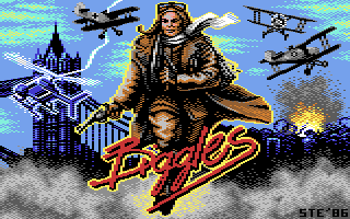
Do You Wanna be a Hero? [2011] |
Credits :
Download :
Look for downloads on external sites:
Pokefinder.org
User Comment
Submitted by Motion on 1 August 2011
| You are totally blowing my mind, Ste! This is a remarkable re-work. ...and to think, I only saw the Biggles movie for the first time, a few months ago (it was great!). Splendid work, ol' chap! ;) |
User Comment
Submitted by DATA-LAND on 19 July 2011
| Another brilliant pic of you! I'm happy you're back! |
User Comment
Submitted by Twoflower on 18 July 2011
| This one is great. I really love the biplanes and the vibe of the background. Something in this breathes 1991-ish games from Enigma Variations. Great improvement from the original, though there's something odd with the logo / character interaction. |
User Comment
Submitted by Yogibear on 18 July 2011
| I think this piccy at least deserves an 8. I gave it a 9! |
User Comment
Submitted by Hoild on 18 July 2011
The original was quite poor, but this one is a nice and genuine C64 GFX. I would vote 6.5/10 for it = definitely above-average, but due to the constraints of the rating system I voted a 7.
(a real 7/10 would be something "very good" by my scale, one notch even above this picture) |
User Comment
Submitted by Yogibear on 18 July 2011
| Wow! 10-12 hours! But then you get a really good product! With my music the 64 version takes much more time than the original! (I compose first on pc with Renoise which is than ported to the Roland Hermans player I use). So in Photoshop cs2 you have the 64 colour palette and pixel size? And yes good idea Slator! These pics deserve a game. Maybe STE should make pictures for Protovision games! Unfortunately not that much games come out but maybe in future? Interested STE?! |
User Comment
Submitted by Jak T Rip on 18 July 2011
User Comment
Submitted by Slator on 18 July 2011
nicely done, wish I could do some games for those pictures :-D
|
User Comment
Submitted by leonofsgr on 18 July 2011
| i like the redesign. the smoke on the right bottom and the colors of the explosion work great. |
User Comment
Submitted by hedning on 18 July 2011
| Really nice! I like the poster style, and the choice of colors. |
User Comment
Submitted by Exploding First on 18 July 2011
User Comment
Submitted by Wile Coyote on 18 July 2011
| Great choice of colours. Vast improvement compared to your original attempt. |
User Comment
Submitted by STE'86 on 18 July 2011
it's difficult to give a timeframe on this one, because the Biggles figure was mainly redone last year, i just didnt know what else to do with it. I picked it up again a few weeks ago and kept fiddling with it while i was doing "here be dragons" but in the last week everything seemed to fall into place. it has however been one of my longest ever projects simply because it had no real "goal" it just evolved.
usually i would say a project would take somewhere in the region of 10-12 hours overall.
as to the app, my choice is Photoshop cs2. |
User Comment
Submitted by Yogibear on 17 July 2011
| Really like this one! Great! Much better than the early version! Just curious: How long does it take to make such an enhancement and what drawing prg do you use? Compared to this Ratt's version looks pretty crappy! |
User Comment
Submitted by PAL on 17 July 2011
Like the original you did more than this crappy new one...
.... no really, fantastic update dude. Love it! Ritch and full of nice details and so clean at the same time... the bottom is absolutely marvelous and all the love put into the whole image really shows! |
|
|
|
 | Search CSDb |
|
 | Navigate |  |
|
 | Detailed Info |  |
|
 | Fun Stuff |  |
· Goofs
· Hidden Parts
· Trivia
|
|
 | Forum |  |
|
 | Support CSDb |  |
|
 |  |
|


