|
| |
|
2000 Kung-Fu Maniacs [2011] |
Credits :
Download :
Look for downloads on external sites:
Pokefinder.org
User Comment
Submitted by Kenz on 6 September 2011
I've added a download for the final version of this loading screen. Due to popular demand (heh!) it features the blue Psytronik logo and I've also changed the orange flesh tones to pink which look better on a real C64. Enjoy!
|
User Comment
Submitted by Jak T Rip on 3 August 2011
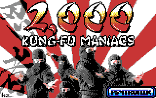
| I counted them. There are only 5 kung-fu maniacs. |
User Comment
Submitted by wacek on 2 August 2011
| As for that Samsung screenshot, it may be that there is some dynamic contrast thingy turned on (all the modern tvs have some sort of process for that), I'd also check if any "profile" (film/tv/game/vivid etc) is set. Usually "game" profiles are most pumped, and "film" ones most timid. |
User Comment
Submitted by Yogibear on 1 August 2011
| Great pic! Very atmospheric! |
User Comment
Submitted by Wile Coyote on 1 August 2011
I always viewed the logo as a take on the OCEAN logo, which was blue.
The blue logo works better than the red logo for all those reasons |
User Comment
Submitted by Deev on 1 August 2011
looks pretty nice, hope we'll see more from you in the future! (you were one of my first demo sources back in the 90s, part of the reason I'm here I guess!). Another vote for the blue logo!
And too much bickering about palettes, again... |
User Comment
Submitted by Ksubi on 31 July 2011
| Very nice work! And go with the blue logo... much more Oceanic :) |
User Comment
Submitted by JCB on 31 July 2011
| Yes, blue please :) Looks much nicer. |
User Comment
Submitted by chatGPZ on 31 July 2011
yes go for the blue logo. logo is supposed to stand out and it works much better that way :)
and could look in your c64 and tell exactly what VIC you have? (just tell everything that is written on it). and what kind of tv is this, relatively new? the kind of picture quality as in the pacman picture reminds me of the overbright colors we get on the equipment at parties (for example, yellow and white are almost the same, light grey is almost white). the famous 220ohm fix does the trick there :) |
User Comment
Submitted by Kenz on 31 July 2011
| You know, I'm preferring the blue logo too. Maybe I'm just used to seeing the blue logo on Psytronik pics. Hmm, might change it back to blue before the game is mastered ... ! |
User Comment
Submitted by Kenz on 31 July 2011
| Ah, as a relative newcomer to CSDb so I was unaware of all the hoo-hah surrounding the C64 palette. My philosophy is simple - draw a C64 pic so that it looks good on a C64 hooked up to a telly. Job done, move on to the next project. :) |
User Comment
Submitted by PAL on 31 July 2011
| Love it! but better with blue logo! |
User Comment
Submitted by DeeKay on 31 July 2011
Quote:a real one obviously. just like the rest of us remember, who maintain that the default emulated palette that "certain" people on here say is 100% accurate, is anything but.
*sigh*... Steve, when will you finally be able to realize that there is not THE ONE palette but that there's many different versions of VICs with varying colors, many different kinds of monitors (or even TVs) and also an infinite number of ways that the dials on said monitors can be set?
It's even way way worse than with the variety of SIDs if you add the monitor into the equation.....
So the Palette that VICE and other c64 programs use is the one that is the *most common*, not the be-all palette that represents every c64-setup out there 100%!...
Pepto's palette is in so far the most accurate, because it's not congesture and not like the self-made "i think this is about right" palettes before it. He was the only person that actually took a vectorscope (well, homecat's friend did, and I sent Pepto the images! ;-) and made some measurements using a real (very common model) c64 to then *calculate* the palette from this data...
P.S: Wow. Palette discussion with Steve, now that's something new! ;-) |
User Comment
Submitted by Kenz on 31 July 2011
Yep, these are the default "switch on" settings for the TV - I haven't increased any colour / brightness settings. And it's a standard breadbin style C64 that is plugged into it.
Oh yes, and the colour palette used for the picture above is "GoDot" - which is the standard setting for the Congo C64 gfx util (which I used to make the .prg file). |
User Comment
Submitted by chatGPZ on 31 July 2011
Quote:a real one obviously. just like the rest of us remember, who maintain that the default emulated palette that "certain" people on here say is 100% accurate, is anything but.
a real one with extremely unusual settings indeed. are the color/contrast/saturation settings in neutral position? i doubt it. |
User Comment
Submitted by iAN CooG on 31 July 2011
nice, reminds me of
 |
User Comment
Submitted by Jazzcat on 31 July 2011
| Awesome work Kenz! Lovely! Looking forward to the full release and also to SEUDS II! |
User Comment
Submitted by STE'86 on 31 July 2011
| a real one obviously. just like the rest of us remember, who maintain that the default emulated palette that "certain" people on here say is 100% accurate, is anything but. |
User Comment
Submitted by Oswald on 31 July 2011
| I believe you now :) Thanks. What type crt / VICII / c64 do you have ? |
User Comment
Submitted by Kenz on 31 July 2011
User Comment
Submitted by Oswald on 31 July 2011
| wow, thats some seriously fucked up crt/VICII. can you dump a screenshot of fex this: Ms. Pac Man aswell ? |
User Comment
Submitted by Kenz on 31 July 2011
Here's how the pic looks on a real C64:-
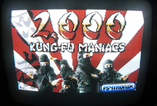
That better, Oswald? That's an earlier version BTW - which is why the Psytronik logo is blue.
("Totally faked" is a bit harsh - how about just saying "it's a bit dark?") |
User Comment
Submitted by chatGPZ on 31 July 2011
| nice picture anyway :) the palette of the screenshot is a bit unreal though, indeed. cant crank up saturation so much at all =) |
User Comment
Submitted by Oswald on 31 July 2011
| palette is totally faked, unreal colors. |
User Comment
Submitted by Wile Coyote on 31 July 2011
I like the vibrancy of the image. The red stripes in the background could have been anti-aliased better.
The Ninjas look photo real, and the Ninja to the far left looks like Kenz ;D |
User Comment
Submitted by Joe on 31 July 2011
| Cool! Now please find a nice way of releasing your other images we've seen on Facebook! |
|
|
|
 | Search CSDb |
|
|
| Navigate | |
|
| Detailed Info | |
|
| Fun Stuff | |
· Goofs
· Hidden Parts
· Trivia
|
|
| Forum | |
|
| Support CSDb | |
|
 |  |
|