|
| |
|
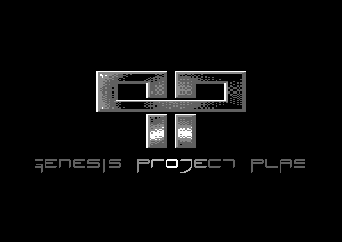
Genesis Project "Plasma Intro" [2012] |
AKA :
G*P Plasma Intro
Credits :
SIDs used in this release :
Cracks which use this intro :
Download :
Look for downloads on external sites:
Pokefinder.org
User Comment
Submitted by Sixx on 10 July 2019
@Cresh
1. We're not living in the past.
2. It cleary says gp. |
User Comment
Submitted by Cresh on 18 February 2012
Looks fresh/clean/nice and I like it a lot!
But:
1. Would be useless back in the day when disk blocks counted.
2. It says qp. |
User Comment
Submitted by celticdesign on 18 February 2012
User Comment
Submitted by hedning on 18 February 2012
User Comment
Submitted by Wile Coyote on 28 January 2012
Good tune. Nice font. I liked the plasma movement.
Given the small area and square-ness of the plasma area,
I couldnt help but think, with the use of sprites 1 or 2 possibly 3 more colours could have been used on the plasma.
|
User Comment
Submitted by Yogibear on 28 January 2012
| Like that logo with effect in it! |
User Comment
Submitted by CONS on 27 January 2012
| The plasma and the font stand out. I like the simple and clean style of this intro. |
User Comment
Submitted by Elder0010 on 27 January 2012
| still looping since yesterday!!! |
User Comment
Submitted by itch on 27 January 2012
User Comment
Submitted by Achim on 27 January 2012
| One of the most stylish intros ever. |
User Comment
Submitted by Dr.j on 27 January 2012
User Comment
Submitted by Pantaloon on 27 January 2012
User Comment
Submitted by Slator on 27 January 2012
User Comment
Submitted by dflame on 27 January 2012
User Comment
Submitted by Stone on 27 January 2012
User Comment
Submitted by E$G on 27 January 2012
| Smooth I like it nice muzak too! |
User Comment
Submitted by Skate on 27 January 2012
| me likes! (jar jar style comment :)) |
User Comment
Submitted by Cruzer on 27 January 2012
| Smooth plasma. Gives a nice shiny feel to the logo. |
User Comment
Submitted by Fredrik on 27 January 2012
User Comment
Submitted by Jazzcat on 27 January 2012
| Cool intro! Nice one dudes |
User Comment
Submitted by Yazoo on 27 January 2012
| very nice intro. but what does "qp" mean? :) |
User Comment
Submitted by ChristopherJam on 27 January 2012
| Very cool. Nice effect, sharp design, near flawless execution. |
User Comment
Submitted by Fierman on 27 January 2012
User Comment
Submitted by TWW on 27 January 2012
User Comment
Submitted by bepp on 26 January 2012
| Now this is THE 2012 intro so far! |
User Comment
Submitted by TheRyk on 26 January 2012
| That's what I call an intro: plain, clear, kewl. SID's a perfect match. |
|
|
|
 | Search CSDb |
 |
|
 | Navigate |  |
|
 | Detailed Info |  |
|
 | Fun Stuff |  |
· Goofs
· Hidden Parts
· Trivia
|
|
 | Forum |  |
|
 | Info on other sites |  |
|
 | Support CSDb |  |
|
 |  |
|


