|
| |
Released At :
X'2012
Achievements :
C64 Demo Competition at X'2012 : #12
Credits :
SIDs used in this release :
Download :
Look for downloads on external sites:
Pokefinder.org
User Comment
Submitted by Jetboy on 4 May 2024
User Comment
Submitted by Wile Coyote on 2 January 2022
Ready. of Hokuto Force and Level 64 voted 6/10
Check out Cannone (2007) ;P
Cannone |
User Comment
Submitted by Wile Coyote on 6 December 2021
Thanks for the positive comments. Thanks to HCL for making my ideas/design become reality.
An idea that i never shared at the time, was the idea of including a simple to use draw program that would allow the user to draw his or hers own Bob using 3 shades of grey. The Bob would then appear in the demo in place of the default Bob.
@Clarence Strange Day would fit in well with that demo. |
User Comment
Submitted by KAL_123 on 17 November 2020
User Comment
Submitted by FATFrost on 9 June 2013
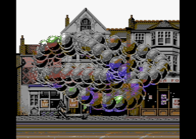
Shhhh,, is that the triangle head from Silent Hill in front of the shop?!?!!
I can't believe I only just spotted that!! |
User Comment
Submitted by Frantic on 30 May 2013
Sure looks like a strange day. Yet so real! :D
Cool stuff! |
User Comment
Submitted by ccr on 19 November 2012
| Technically interesting and refreshing, showing something I can't remember seeing before, at least in this way. Also kind of pretty, but felt incomplete somehow. Very nice in any case. \:D\ |
User Comment
Submitted by Jak T Rip on 12 November 2012
| Music and Gfx are brilliant! Hate the bobs as they do not fit in my eyes. Nice terry guilliam style! |
User Comment
Submitted by Optimus on 3 November 2012
| The unlimited bobs are nice actually, give you the impression of blending, crystal, refracting the background or something, cause they are using the tile colors from background. Graphics are weird, like a monty python sketch. Interesting little screen. |
User Comment
Submitted by Yogibear on 2 November 2012
| Yes especially like the gfx! |
User Comment
Submitted by Clarence on 30 October 2012
| Nice looking little screen. Feels like a part from Zeros & Ones. |
User Comment
Submitted by Joe on 30 October 2012
| Hm... The image bothers me. It says Mayfair something on one sign and polish fo.. on another. First I was thinking about London and the areas in Mayfair close to Shepherds Market they have that scale, but it doesn't make any sense due to the face of the buildings. Normally the (Georgian) terraced house doesn't come with a gable or frontispiece such as depicted in the classical order. But the feel is very British. |
User Comment
Submitted by Tim on 30 October 2012
| Been a long time since I loved a graphics this much.. fondly reminds me of the south of UK, Bexhill, Eastbourne, etc. Good stuff! |
User Comment
Submitted by Yazoo on 30 October 2012
| it has a nice style. thumb up |
User Comment
Submitted by Matt on 29 October 2012
@Twoflower: thanks for that. I must have missed out on that neat little production somehow!
Cheers :-) |
User Comment
Submitted by lemming on 29 October 2012
User Comment
Submitted by Twoflower on 29 October 2012
@Matt: This tune was already featured in a near perfect context - check out The Sun by Kjell.
All in all, this is a great and inspiring little piece of demo. A worthy follow-up to previous achievements, WEC. |
User Comment
Submitted by Matt on 29 October 2012
@Zyron yeh but it's really an awesome tune man. Haven't often heard a composition so atmospheric like this one!
I guess the tune was simply awaiting a demonstration like this. |
User Comment
Submitted by Sixx on 29 October 2012
User Comment
Submitted by Zyron on 29 October 2012
| Love the atmosphere here. The inclusion of this old tune of mine was a pleasant surprise. |
User Comment
Submitted by mankeli on 29 October 2012
I was so disappointed when I realized that the picture isn't going to start scrolling.
Otherwise, nice prod. |
User Comment
Submitted by Peacemaker on 29 October 2012
| the picture is great. i was realy impressed when it saw it at the bigscreen at X. nice work there. |
User Comment
Submitted by Joe on 29 October 2012
User Comment
Submitted by FATFrost on 29 October 2012
| This felt otherworldly!!! Awesome!! |
User Comment
Submitted by G-Fellow on 28 October 2012
| I love this piece of demo, too. The background looks so absolut real, it is amazing. |
User Comment
Submitted by Matt on 28 October 2012
I really love this.
For some reason this reminds me of Darkseed.
I reckon it's the atmosphere in this little production that grabbed me the most. |
|
|
|
 | Search CSDb |
|
 | Navigate |  |
|
 | Detailed Info |  |
|
 | Fun Stuff |  |
· Goofs (2)
· Hidden Parts
· Trivia
|
|
 | Forum |  |
|
 | Info on other sites |  |
|
 | Support CSDb |  |
|
 |  |
|


