|
| |
Released At :
3-Color-Logo Competition 2013
Credits :
Download :
Look for downloads on external sites:
Pokefinder.org
User Comment
Submitted by Jak T Rip on 5 May 2013
| So big pixel retro now also conquers the C64! ;-) |
User Comment
Submitted by Motion on 11 March 2013
If this is 'Retro Shit', then gimme a plateful! ;) Good work Yazoo!
|
User Comment
Submitted by Smasher on 4 March 2013
| for some reason I'd like to see Mario back in the compo.. :) |
User Comment
Submitted by Moloch on 20 February 2013
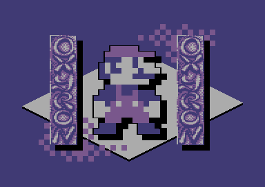
| My least favorite Yazoo entry, its really a logo placed on the screen twice with a picture tacked on. |
User Comment
Submitted by BHF on 19 February 2013
| I like Giana too, but this logopicture is very well made, love it :) |
User Comment
Submitted by Yazoo on 19 February 2013
ok, i had to move this out of the compo because of the limit (max 3 entries each person).
but as i wasnt too happy with this anyways thats pretty ok. |
User Comment
Submitted by dannyk on 17 February 2013
User Comment
Submitted by Dr.j on 17 February 2013
| Very Cool logo! (but its look like a full picture ) LOL . don't call it retro shit , its cool art guyz |
User Comment
Submitted by N3XU5 on 17 February 2013
| great work yazoo! =D .. as always!! ;) |
User Comment
Submitted by Yazoo on 17 February 2013
didi: you may be right. when i made it, i checked the rules and found this:
-----
- Has to be a "logo", means there must be something to read that makes some sense.
- Logo is not limited to letters or digits only. There might be something around/besides/within it.
-----
so i didnt see any problem with this. but dont worry, i think i will maybe "disqualify" this myself at some point because i have another idea for a logo :) and as there is a max of 3 allowed in the compo, the problem (if there is any) may be solved anyways, hehe |
User Comment
Submitted by Didi on 17 February 2013
| A bit less logo besides the rest. Hard on the edge of a "logo". Seems most chars are used for the logo, not for Mario, so it's OK. |
User Comment
Submitted by Bob on 17 February 2013
| Wow thats nice... cool, didn't censor cracked this game ? ;) |
User Comment
Submitted by Slator on 16 February 2013
yazoo, do you listen to purple motion a lot today? :-D I dont like nintendo, but that group you draw the logo for I have heard before.
|
User Comment
Submitted by hedning on 16 February 2013
| I like the pic, but I just said _I_ would prefer Giana. :) |
User Comment
Submitted by TheRyk on 16 February 2013
C'mon guys, hold yer horses, it's not about Mario vs. Giana, focus on the actual logo :)
Logo looks very good but also a little familiar, maybe that's due to having "worked" with Yazoo once or twice.
However, competition will be running for one more month. I'm still waiting for sth really spectacular. It's more the question who is inspired enough to win this competition, talented enough for sure some people are, including Yazoo. |
User Comment
Submitted by hedning on 16 February 2013
| What Ksubi said. And I would have preferred a C64 character - Giana f.ex. |
User Comment
Submitted by spider-j on 16 February 2013
| Mh, Mario ... no, Sorry. Ihmo too uninspired choice of motif. Would like to see sth. like that with a more C64 related character. |
User Comment
Submitted by Ksubi on 16 February 2013
| Nice! (Except for that black pixel on his left foot :)) |
User Comment
Submitted by Yazoo on 16 February 2013
| fungus: thanks... this is more like an experiment... like: how can i fill the screen with xy chars. i still have ~100 free here |
User Comment
Submitted by Fungus on 16 February 2013
| Awesome stuff Yazoo. But I could not vote it higher because it is a pic more than a logo. ;) |
User Comment
Submitted by Yogibear on 16 February 2013
| Like it! Must say I like the blue version without purple more! |
|
|
|
 | Search CSDb |
|
|
| Navigate | |
|
| Detailed Info | |
|
| Fun Stuff | |
· Goofs
· Hidden Parts
· Trivia (1)
|
|
| Forum | |
|
| Support CSDb | |
|
 |  |
|