|
| |
Released At :
3-Color-Logo Competition 2013
Achievements :
C64 Graphics Competition at 3-Color-Logo Competition 2013 : #49
Credits :
Download :
Look for downloads on external sites:
Pokefinder.org
User Comment
Submitted by Jak T Rip on 6 May 2013
| Wow, REALLY NICE!!! This fits into the colour limitation!? Cool cool... |
User Comment
Submitted by Shaun C on 13 March 2013
| I like the abstract prog-rock album cover vibe going on here. Nice angularity in the lettering too! |
User Comment
Submitted by user on 11 March 2013
@Latin I typed into translate.google "My latin is shitty, so the following text is unfortunately translated automatic". But now i always have these scene from "Life of Brian" in my head "People called Romanes, they go, the house?" :D
http://www.youtube.com/watch?v=IIAdHEwiAy8 |
User Comment
Submitted by TheRyk on 10 March 2013
| @Latin: Wasn't aware that there are even translation machines for ancient languages. Just sent the quote to a friend of mine who is a Latin teacher. Guess she and her course will have much fun with it :) |
User Comment
Submitted by bugjam on 10 March 2013
| I think this is absolutely awesome exactly like it is. |
User Comment
Submitted by user on 9 March 2013
Mea est cacas in Latina, et hoc textu solummodo est infeliciter translatus automated ;)
To the size i have to say the following:
Let a Musician do an Sid and he uses all voices, Memory and Rastertime. Let a coder do stuff and he uses all Memory and Rastertime. And guess what you get when you say an artist "do pixel"?
Give me more limitations and i will paint you "da shit" within this limitations. But my only limitation in this compo is 3 colors and 256 chars.
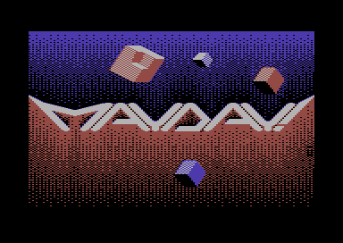
@PAL & Spider: The "Background" is created with the dithered fill algorithm of ProMotion and reduced by hand to fit into the charset. So it is machine made, by ALGOrithm TECHnology :) |
User Comment
Submitted by Yogibear on 9 March 2013
| Like those cubes and overall presentation! |
User Comment
Submitted by The Overkiller on 9 March 2013
User Comment
Submitted by TheRyk on 9 March 2013
| Moloch has a point which is true for more than half of the entries, often too little focus on the actual logo, and too much hocus pocus around. Dejavu: I think I already said so :D Ceterum censeo Carthaginem esse delendam ... ;) |
User Comment
Submitted by spider-j on 9 March 2013
| I feel algorithm vibes in here =) |
User Comment
Submitted by Moloch on 9 March 2013
| I really like the lettering, but too much dithering on the rest of the screen for me. |
User Comment
Submitted by Cargo on 9 March 2013
| Nice, fresh style and good colours!! |
User Comment
Submitted by TheRyk on 9 March 2013
Quote:And who voted 1? That's not realistic and frankly just cheap... :S
Our beloved anonymous downvote coward friend, reliable and fast as always ^^
BTT: So is this really an entry against the rules? Then make it a legal entry, USER, shouldn't be that hard, others modified entries threatened with disqualification in recent compos, too.
Good idea what was recommended about objects in front of the logo, maybe even with some shadowcasting to make it "more dimensional". |
User Comment
Submitted by Hammerfist on 9 March 2013
Oh, PAL beat me to it, but I see light grey, red, blue and a *lot* of dithering too. In fact, pretty well done if it even fooled someone! :D
Still, I like the idea but for me it would've needed some more objects or the objects should've been more prominent. Perhaps even (partially) in front of the logo... 6/10 from me.
And who voted 1? That's not realistic and frankly just cheap... :S |
User Comment
Submitted by PAL on 9 March 2013
Very cool one indeed... I love it even it must have those long dithered patterns that gets to look like machine made in a way... but you know what... it splits the screen and just look raw! great 3 color use, not seen like before. Xenox.AFL, there are only 3 here.
|
User Comment
Submitted by Xenox on 9 March 2013
| Great one, nice idea but, aehm, more then 3 colors... |
|
|
|
 | Search CSDb |
|
|
| Navigate | |
|
| Detailed Info | |
|
| Fun Stuff | |
· Goofs
· Hidden Parts
· Trivia
|
|
| Forum | |
|
| Support CSDb | |
|
 |  |
|