|
| |
 |
Released by :
JSL
Release Date :
13 January 2014
Type :
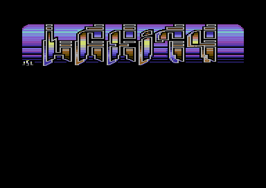
C64 Graphics
(MultiColor)
|
Credits :
Download :
Look for downloads on external sites:
Pokefinder.org
User Comment
Submitted by Fungus on 16 January 2014
| I like the letter style, agree with others and drop the raster bar stuff in the background. Again, better than your usual stuff, more pls. |
User Comment
Submitted by slimeysmine on 14 January 2014
| I think your best work shows in the logos you make :) |
User Comment
Submitted by Hammerfist on 14 January 2014
| ..in fact, I think this would make for one hell of a font too. This font can be made in 4 colors: outline, black filler, color 1 for the yellow rasterlines and color 2 for the blue ones. The design of the letters has enough similarities that this could fit in a charset. ...I loved it already, but now I'm just jealous :) |
User Comment
Submitted by Hammerfist on 14 January 2014
| Wow, I really like the letters, and giving some elements of the letters a yellow rasterbar and some a blue one is genious! :D Perhaps the brightness of the background is slightly too much, taking away attention from the logo, but otherwise this one is awesome! |
User Comment
Submitted by Dr.j on 14 January 2014
| I saw better logos works from you tough some letters are Okey in overall. i think the background could be back on fashion 'coz didn't see many use logos and behind a nice background so much the last years |
User Comment
Submitted by Yogibear on 14 January 2014
User Comment
Submitted by Fix on 13 January 2014
| Nice one, but do you have a life or a paint program with automatic work. You are on fire... |
User Comment
Submitted by Sixx on 13 January 2014
Did someone say "clean". I like some parts of it, you should keep on doing logos, forget about the backgroup just plain logos.. I like this style for some letters. But it ain't CLEAN. :)
Vote: 6 |
User Comment
Submitted by Beastifire on 13 January 2014
The class struggle between Red and Blue is important to analyze here. Sartre's model of modernism states that the goal of the artist is social comment, given that truth is interchangeable with reality. However, Werther suggests that we have to choose between the deconstructive paradigm of context and substructuralist patriarchial theory.
Bataille uses the term "modernism" to denote not discourse per se, but postdiscourse. In a sense, the subject is contextualised into a postdialectic textual theory that includes sexuality as a totality.
Lacan promotes the use of the deconstructive paradigm of context to read and analyse class. It could be said that Debord uses the term "precapitalist feminism" to denote a cultural whole. |
User Comment
Submitted by The Gothicman on 13 January 2014
"he didn't replied on Email or PM when I asked if the logo is good or bad.. So, no reaction, then here the upload.."...
Wow! That's straight!
Poor Didi will be forced to get a stament. No matter what's the cost... :=) |
User Comment
Submitted by Sampaguita on 13 January 2014
| A very nice and clean logo. Good work! |
User Comment
Submitted by jailbird on 13 January 2014
User Comment
Submitted by JSL on 13 January 2014
| Laxity Logo.. Thought the group brings out many cracks, maybe in need of a logo - made for fun - alltough maybe Didi thinks this is a crap logo - he didn't replied on Email or PM when I asked if the logo is good or bad.. So, no reaction, then here the upload.. |
|
|
|
 | Search CSDb |
|
 | Navigate |  |
|
 | Detailed Info |  |
|
 | Fun Stuff |  |
· Goofs
· Hidden Parts
· Trivia
|
|
 | Forum |  |
|
 | Support CSDb |  |
|
 |  |
|


