|
| |
|
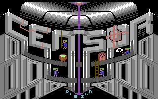
Censor Design Logo "Lemmingventure" [2014] |
AKA :
Lemmings On Concrete
Credits :
Download :
Look for downloads on external sites:
Pokefinder.org
User Comment
Submitted by Joe on 9 April 2014
The logo is cleverly simple, but the highlights a little week. One could use lt.green or something else to make things smooth. Have a look at Thomas Heinrichs (X-Ample Architectures) graphics for inspiration just to mention one. With the powerful strength of the masculine approach of bent metal, laser plasma and so forth, the Lemming figures and the design letters in the bottom seem out of place.
But here comes an interesting architectural phenomena: When dealing with the section and populating it with people of what seems to be inside a construction. Try every way to cross the causality of describing it as just compartments instead of seeing it as a complete open space (underneath the logo). Let them walk behind columns or cross the slabs.
I think this goes as well for the idea that the black border of the restricted resolution tells me, you dont conceive what is going on outside of the border being relevant. It shows in the ambivalence you must have had when doing those windows in the lower part. |
User Comment
Submitted by CONS on 8 April 2014
| While i like the idea, i find the grey area below the logo a little distracting from the logo itself. It kind of steals the presense of it a little imho. |
User Comment
Submitted by Bob on 6 April 2014
This is really cool!, love it :)
excellent work, cool design. |
User Comment
Submitted by jailbird on 5 April 2014
Awesome concept! :)
Although, it would need a bit more anti aliasing, it looks like it was forgotten here and there. |
User Comment
Submitted by Conjuror on 5 April 2014
| A really original design. Yes more lemmings may have been better but then maybe that would have been too crowded. Really nice. |
User Comment
Submitted by Ksubi on 5 April 2014
Looks great! However, I think that removing the lemmings may give a more polished appearance.
At this stage they're a distraction due to the colours and placement.
Nonetheless, a great idea. I'm constantly amazed at your variety in design and styles :) |
User Comment
Submitted by Dr.j on 4 April 2014
| yo Andy I see a great progress in making full screen pictures. this one is lovely and interesting. its great to see you are so active lately . keep it going mate!!! |
User Comment
Submitted by psych on 4 April 2014
User Comment
Submitted by leonofsgr on 4 April 2014
| nice and cool mini lemmings ;_) |
User Comment
Submitted by wysiwtf on 4 April 2014
this is almost mermaid-level-cute
I like :) |
User Comment
Submitted by TheRyk on 4 April 2014
User Comment
Submitted by Doc Strange on 4 April 2014
| Really interesting and nicely executed. More please. |
User Comment
Submitted by STF on 4 April 2014
User Comment
Submitted by CRT on 4 April 2014
| Great! I really like the details but it's never enough lemmings :-) |
User Comment
Submitted by Elder0010 on 4 April 2014
| funny and original concept! awesome! |
User Comment
Submitted by Oswald on 4 April 2014
| nice, but my brain hurts trying to understand the escherisch space :) |
User Comment
Submitted by Sounx on 4 April 2014
User Comment
Submitted by Conrad on 4 April 2014
User Comment
Submitted by lemming on 4 April 2014
User Comment
Submitted by Yazoo on 4 April 2014
User Comment
Submitted by iAN CooG on 4 April 2014
|
|
|
 | Search CSDb |
|
 | Navigate |  |
|
 | Detailed Info |  |
|
 | Fun Stuff |  |
· Goofs
· Hidden Parts
· Trivia
|
|
 | Forum |  |
|
 | Support CSDb |  |
|
 |  |
|


