|
| |
Released At :
Gubbahelg i Lund II - Isterparty 2014
Achievements :
Mixed Demo Competition at Gubbahelg i Lund II - Isterparty 2014 : #3
Credits :
SIDs used in this release :
Scrolltext and other text in this release : ()
Download :
Look for downloads on external sites:
Pokefinder.org
User Comment
Submitted by celticdesign on 19 April 2014
User Comment
Submitted by Martinland on 15 April 2014
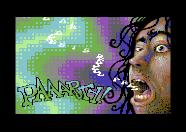
| The smooth, sub-pixel warp fx on the face is especially awesome ... though you're only able to see it after reading the scrolltext for quite a while! ;) ;) ;) |
User Comment
Submitted by hedning on 15 April 2014
| Crocs are always unbeatable. Look at Gary. We chose not to include a croc in this release to make the compo more fair. :P |
User Comment
Submitted by Sith on 15 April 2014
| I like Mermaid's croc more tho, but this is cool. |
User Comment
Submitted by hedning on 15 April 2014
User Comment
Submitted by STF on 14 April 2014
| Coof stuff with great gfxs and music. |
User Comment
Submitted by HCL on 13 April 2014
User Comment
Submitted by Dr.j on 13 April 2014
| Ass kicking gfx and lovely paaarty release. also the music is cool . party on dudez!!! yehaaa lovely G*P production |
User Comment
Submitted by TheRyk on 13 April 2014
| @mmd: thx for explaining, didn't think about the necessity of three day designer 5 o clock shadow ;) |
User Comment
Submitted by Shine on 13 April 2014
| Mermaid rocks!!! Very nice gfx! :) |
User Comment
Submitted by Mermaid on 13 April 2014
TheRyk: Thanks for the feedback - dark grey/dark brown isn't dark enough for the stubble, I'm afraid. As for the logo, I was restricted to using only $d021 plus $d800, I'm sorry it didn't turn out better.
Depressing fact: I started on the face in 1995/96, so it's older than a lot of the people who were at the party. |
User Comment
Submitted by TheRyk on 13 April 2014
| the idea with plasma fx moving same direction as escalator scroll also works fine. |
User Comment
Submitted by TheRyk on 13 April 2014
Awesome tune, celtic.
About the rest, well, "party" text and the black in the guy's face (would have looked better if replaced by dark grey/dark brown imho) are the only points I'd criticize.
On the other hand, hair, eyebrows and the somewhat drunk/lunatic expression are awesome. |
User Comment
Submitted by ALIEN on 13 April 2014
| I love that kind of new scrollerideas and powerful colorplasma - thanks for this one! |
User Comment
Submitted by ѕiηk on 13 April 2014
| nice colors, nice gfx, nice tune, nice code, nice 1 screen prod! |
User Comment
Submitted by Zierliches Püppchen on 13 April 2014
| great ... crew drunk ... perfect party :D Lovely little Demo :D |
User Comment
Submitted by Elder0010 on 12 April 2014
| great music and gfx, smart routine! |
User Comment
Submitted by Yogibear on 12 April 2014
User Comment
Submitted by FATFrost on 12 April 2014
hmmm... so.. looks like i won't show any ideas again before release....
nice part anyway..and tune and plasma are ace! |
|
|
|
 | Search CSDb |
|
 | Navigate |  |
|
 | Detailed Info |  |
|
 | Fun Stuff |  |
· Goofs
· Hidden Parts
· Trivia
|
|
 | Forum |  |
|
 | Info on other sites |  |
|
 | Support CSDb |  |
|
 |  |
|


