|
| |
|
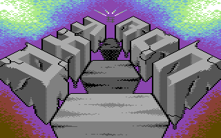
Oxyron Logo "Stone R(age)!" [2014] |
Credits :
Download :
Look for downloads on external sites:
Pokefinder.org
User Comment
Submitted by N3XU5 on 3 August 2014
| another very nice logo from you, Andy! I like the colors on this one! You improved a lot! Keep 'em comin' ;) |
User Comment
Submitted by The Phantom on 3 August 2014
Really impressive work Andy. I remember when I started drawing "rock" lettering on paper, you've taken it a level beyond.
There are small errors in your shading (like some of the cracks look 2d and flat).
Otherwise, another fine piece of artwork. Nice work! |
User Comment
Submitted by Shine on 3 August 2014
@||:
Big thanks for your attention about my work! ;) Your comments and suggestions (on Facebook too) helps me alot and is always welcome! <3 |
User Comment
Submitted by jailbird on 2 August 2014
| Nice one Shine! Once again: you show progress in your pixelling knowledge, while maintaining interesting ideas. Keep up with the great work :) |
User Comment
Submitted by Zierliches Püppchen on 2 August 2014
Got your email :D,
great, one if not your best so far. I was not sure at all, spent 8 or 9 its in the middle between. U successfully managed to get better and better ... lets see the next one! Yazoo Style heaven grid and crackles ... good choice :D Sorry i am a bit drunken and its 3:30 AM in the Morning :D |
User Comment
Submitted by slimeysmine on 1 August 2014
User Comment
Submitted by Medicus on 31 July 2014
Not a bad logo but I have seen some logos from JSL which had about the same quality and got a lot lower rating.
Not really fair, right? ;) |
User Comment
Submitted by Moloch on 31 July 2014
User Comment
Submitted by CRT on 31 July 2014
| Another nice one and good job on the Yazoo-style dithering! |
User Comment
Submitted by Mermaid on 30 July 2014
User Comment
Submitted by Joe on 30 July 2014
Nice. There are some things to explore further, such as the distance to the tree blocks in the center: They are darker towards the vanishing point. The letters however keep the same light all over. If positioned differently, the letters could stand out from the blocks (they look connected) and perhaps cast shadows to describe greater depth.
The overall purple contour makes the background slightly dull, although giving it a radiant feeling. Perhaps the background should have been made completely regardless of what would be onto it instead. Especially since its mirrored. Try to think about your compositions as layering in depth instead of placing objects in a plane. It will give you more freedom. |
User Comment
Submitted by Wisdom on 30 July 2014
| Very nice and refreshing. |
User Comment
Submitted by leonofsgr on 30 July 2014
User Comment
Submitted by Celtic on 30 July 2014
| Yeah i like you stuff, interesting designs. I wonder what kind of logo you would make if Hotline was still around, so my question is, do you take requests? |
User Comment
Submitted by Unkle K on 30 July 2014
| This is a really nice logo!! |
User Comment
Submitted by Conrad on 30 July 2014
| You're very good at this style of graphics. This one is the best so far! |
User Comment
Submitted by STF on 30 July 2014
| Nice one, good job mate ! |
User Comment
Submitted by dflame on 30 July 2014
| really horny number would like to have something as dflame;) |
User Comment
Submitted by Dr.j on 30 July 2014
| Excellent work Andy , i like the 3d perspective and also the nice design. its fresh and cool . 10/10 mate! keep the good job , love you works |
|
|
|
 | Search CSDb |
 |
|
 | Navigate |  |
|
 | Detailed Info |  |
|
 | Fun Stuff |  |
· Goofs
· Hidden Parts
· Trivia
|
|
 | Forum |  |
|
 | Support CSDb |  |
|
 |  |
|


