|
| |
Credits :
SIDs used in this release :
Download :
Look for downloads on external sites:
Pokefinder.org
User Comment
Submitted by daison on 10 October 2014
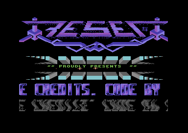
| The d016 wave works well on that logo |
User Comment
Submitted by Xenox on 27 August 2014
| For me, there is a bit too much action on the screen, not the stuff i like, only 5 points from me, sorry. |
User Comment
Submitted by Dr.j on 17 August 2014
Thanks to all for the warm response.
we try to make more retro stuff for your pleasure |
User Comment
Submitted by Unkle K on 17 August 2014
| Dr.J and Shine did a great job with this intro, which was built around celticdesign's wonderful music. Thanks again guys! |
User Comment
Submitted by Conjuror on 16 August 2014
| Nicely sequenced intro and good music and gfx. Good work guys. |
User Comment
Submitted by slimeysmine on 16 August 2014
| Lovely intro and what a great issue 4! Great work Kevin :) |
User Comment
Submitted by STF on 16 August 2014
| Really cool work mates, Nice design :) |
User Comment
Submitted by Wisdom on 16 August 2014
| Very solid intro, with nice D016 effects and scroll reflection. Great oldschool feeling. Thumbs up, Dr.J and Shine! (Early morning, couldn't see it with the music yet). |
User Comment
Submitted by Yogibear on 15 August 2014
User Comment
Submitted by user on 15 August 2014
User Comment
Submitted by hedning on 15 August 2014
User Comment
Submitted by TheRyk on 15 August 2014
@ "too much":
only true for the grey palette, otherwise I like the tech-tech reflection
_if_ anything's too much, I'd rather drop the 1x1 font and use the same font as in rest of prod and no extra color palette for the star bling bling either, but that's already criticism on a very high level |
User Comment
Submitted by Doc Strange on 15 August 2014
| Really like it, there is depth and enough dynamism. Reflection of the scrolltext is a bit too much but all the rest is really well designed. |
User Comment
Submitted by Dr.Science on 15 August 2014
| Really Oldschool style! :-) |
User Comment
Submitted by Dr.j on 15 August 2014
Thanks TheRyk , it was a big pleasure to make the intro together with Shine for Uncle K. staff. also thanks to CelticDesign for the great tune , i love the magazine and hope it will reach to alot of c64 lovers .
hope everyone enjoy our intro with some retro feeling |
User Comment
Submitted by TheRyk on 15 August 2014
great production by some great guys!
very nice idea to give this shine gfx a wobble tech tech effect, music is great in itself but also a good match to this screen |
|
|
|
 | Search CSDb |
|
 | Navigate |  |
|
 | Detailed Info |  |
|
 | Fun Stuff |  |
· Goofs
· Hidden Parts
· Trivia
|
|
 | Forum |  |
|
 | Support CSDb |  |
|
 |  |
|


