|
| |
 |
Released by :
Keys
Release Date :
15 January 2015
Type :
C64 Graphics
(MultiColor)
|
Credits :
Download :
Look for downloads on external sites:
Pokefinder.org
User Comment
Submitted by Jak T Rip on 3 May 2015
User Comment
Submitted by Keys on 18 January 2015
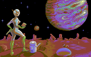
| Thanks for the comments and critiques. Everyone has their tastes. For this pic, I wanted space to feel like the large dark void it is. |
User Comment
Submitted by Jammer on 17 January 2015
| I also agree more with JSL about sky quality however... such a rich space scape wouldn't fit here at all - picture comprises of mostly flat colour areas with little if any dithering so Leon does not really belong here ;) |
User Comment
Submitted by plagueis on 17 January 2015
| @TP Have to agree with JSL on this one -- *strongly* |
User Comment
Submitted by The Phantom on 17 January 2015
I happen to like this drawing. Really reminds me on a koala-pad drawing I did in my "pre-bbs" days. Actually feels a lot like that image. Thanks for that Keys :)
JSL: We have different views on how the universe should be drawn. I think this is how it should be done: Who Rules the Universe?
Keep up the GREAT work Keys.. Looking forward to your next released. |
User Comment
Submitted by JSL on 17 January 2015
Nice SF one, Keys, Nice colours on the planet and the Alien, and Droid, a bit minimalistic on the surface, and the universe is a bit dull, too much black, some nebula's and stars or other planets or spaceships would fit, I am myself bad in Scifi, so I must shut my mouth, but just some suggestions. Look at the example from Leon, how to fill the universe..
Cloud Nine
ps: Yes, like everyone I saw the Commodore Sign. ;) |
User Comment
Submitted by finchy on 17 January 2015
User Comment
Submitted by Firehawk on 17 January 2015
| Planet is AWESOME.. Very nice work. |
User Comment
Submitted by Moloch on 16 January 2015
User Comment
Submitted by chatGPZ on 16 January 2015
| i really like the look of the planet.... the rest, mmmh :) |
User Comment
Submitted by Doc Strange on 15 January 2015
| Great piece of artwork, well done. |
User Comment
Submitted by Keys on 15 January 2015
| Thanks everyone. I actually started on this for the SF Graphics Compo, but life got busy and I didn't finish it in time. |
User Comment
Submitted by Shine on 15 January 2015
| Cool one ... esp. love the planet! ;) |
User Comment
Submitted by Oswald on 15 January 2015
| really good stuff, colorful, well lit, nice shapes. |
User Comment
Submitted by Joe on 15 January 2015
User Comment
Submitted by bugjam on 15 January 2015
| Great! This would have fit very well into the SF graphics compo. |
User Comment
Submitted by FATFrost on 15 January 2015
User Comment
Submitted by Hammerfist on 15 January 2015
| And that choice of colors: excellent! |
User Comment
Submitted by Hammerfist on 15 January 2015
| Oh wow, this just breathes 50s sci-fi! Could have been the cover of one of those old sci-fi pockets my dad collected in his youth. Love this! |
|
|
|
 | Search CSDb |
|
 | Navigate |  |
|
 | Detailed Info |  |
|
 | Fun Stuff |  |
· Goofs
· Hidden Parts
· Trivia
|
|
 | Forum |  |
|
 | Support CSDb |  |
|
 |  |
|


