|
FUCKIN' Single-Day is Comin' [2015] |
AKA :
The Love day picture, No Copy!
Credits :
Download :
Look for downloads on external sites:
Pokefinder.org
User Comment
Submitted by Jak T Rip on 4 March 2015
User Comment
Submitted by GH on 15 February 2015
User Comment
Submitted by celticdesign on 15 February 2015
User Comment
Submitted by Dr.j on 15 February 2015
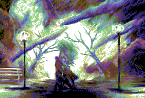
| @blurry: sorry that i enter for a open door but the blurry effect is usually used on leon pics, its one of his biggest trademark i think. i myself love this style and abstract feeling , a bit expand the terms of c64 gfx to a new style and technique . its like to watch a picture in the museum , get you to think what the author wanted to say (his world..his vision... relations ) its like a book |
User Comment
Submitted by Rudi on 14 February 2015
| Imho, the image has an abstract and somewhat blurry feel to it. Some details that are dithered are a bit too blurry, but I dont know if that was intentional or not. I dont know if that's a restriction in the FLI-format that is used here, etc. The color-scheme are are all good. Overall this painting works for me. Good work. |
User Comment
Submitted by Yogibear on 13 February 2015
User Comment
Submitted by Digger on 13 February 2015
| Incredible color ramps and mood! |
User Comment
Submitted by Dr.j on 13 February 2015
| you need to put this picture at the Louvre museum , i love your imagination and you translating it to pure art Leon |
User Comment
Submitted by psych on 13 February 2015
| Love these colors and "blur" effect truly moves my imagination. |
User Comment
Submitted by JSL on 13 February 2015
| XIII: Others give oppinions, dragging down releases with jokes, and I don't smoke, just giving oppinion, if it happens there is a Dragon involved, just see it as a Artistic joke, from another graphician. ;) |
User Comment
Submitted by xIII on 13 February 2015
| @JSL: what did you smoke ? |
User Comment
Submitted by JSL on 13 February 2015
| First, the colorsheme is very nice. I hardly see the difference what male/female is, and the trees are very bald, with a middle tree behind the couple with heaps of leaves, maybe middle in the Winter, and also Summer, but nevermind, realism is something unreal, you even could put a dragon in it, kissing the couple. Even the diagonal clouds are unrealistic, but you're coming there. ;) Not perfect. 7/10. |
User Comment
Submitted by HCL on 13 February 2015
User Comment
Submitted by ilesj on 13 February 2015
| Lovely picture! And very nice of you Leon to share the psd files of your artwork lately. It's always interesting to see some insights on how artists are working. |
User Comment
Submitted by Adam on 13 February 2015
User Comment
Submitted by Jammer on 13 February 2015
| IFLI is not passe! Interlaced pictures will always have this specific 'antialiased' charm and 'newskoolers' might talk whatever they want ;) Isn't it kind of paradox that one of the most technically advanced tricks around here is now considered a song of the past? :D |
User Comment
Submitted by jailbird on 13 February 2015
A bit hard to identify details of the picture (I suppose it's a woman in the middle? And, what are those huge fluffy tentacles around her?).
However, at least this way it leaves more to the imagination, and the color-scheme is lovely. |
User Comment
Submitted by Xenox on 13 February 2015
| Amazing, i really love your work...! |
User Comment
Submitted by Shine on 13 February 2015
| THIS IS SO UBER NICE!!! <3 Leon ... this one kick ass! What a nice composition, but i don't like interlace at all. 10/10 ;) You are the endboss! ,) |
|
|
 | Search CSDb |
 |
|
 | Navigate |  |
|
 | Detailed Info |  |
|
 | Fun Stuff |  |
· Goofs
· Hidden Parts
· Trivia
|
|
 | Forum |  |
|
 | Support CSDb |  |
|
 |  |
|


