|
| |
|
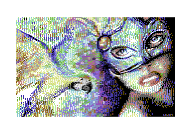
Chaos in Rio - The Chaotic Dithering [2015] |
Released At :
Function 2015
Achievements :
Mixed Graphics Competition at Function 2015 : #3
Credits :
Download :
Look for downloads on external sites:
Pokefinder.org
User Comment
Submitted by Jak T Rip on 28 September 2015
| Cool n fresh! Was funkpaint involved in this? |
User Comment
Submitted by Sledge on 14 September 2015
| How wonderful it is to read the comments. Here we have a picture created by Leon. It is to be compared with a real painting, by someone who paints. Yet we tend to judge it from a technical view. "Eyes is not aligned to each other, wings are not really good etc". Judge the picture from what it is, a painting. And being only that, I think it's really good. It has something. But that's me and how I feel about it :) |
User Comment
Submitted by Sledge on 14 September 2015
| This one I like a lot. 160 x 200 rules! |
User Comment
Submitted by Dr.j on 14 September 2015
| great piece of Art Leon , and Multicolor is really good for you for constant workflow (myself don't fond of FLI or IFLI workd) |
User Comment
Submitted by Zierliches Püppchen on 14 September 2015
| Leon! Great Picture! Multicolor is King ;-) |
User Comment
Submitted by GH on 14 September 2015
The eye still looks natural to me despite the anatomy lesson ;)
Great stuff Leon!
Selina Kyle comes to mind immediately :D |
User Comment
Submitted by Shine on 14 September 2015
| Yeah ... Multicolor !!! :) Nice nice! ;) |
User Comment
Submitted by Hoild on 14 September 2015
| If this is a No Copy release, _drawn_ by Leon, it is an 8/10 on my scale. CONGRATS! |
User Comment
Submitted by GeoAnas on 14 September 2015
User Comment
Submitted by Smasher on 13 September 2015
User Comment
Submitted by Frantic on 13 September 2015
| Totally agree with Hedning here ("I like this style much more than the IFLI brown sauce"). |
User Comment
Submitted by PAL on 13 September 2015
| it is very different in a way... thanx for creating so much art! |
User Comment
Submitted by leonofsgr on 13 September 2015
Haha! :_) Okey or not okey... left or right eye... problems here, problems there... :_)
Dudez! It's a simple No Copy picture... not "photo-convert" :_) ...and yes, i can't draw... X_D |
User Comment
Submitted by nice on 13 September 2015
| ...especially in multicolor! |
User Comment
Submitted by nice on 13 September 2015
| The parrot's left wing isn't totally OK, the mask is leaning and the girl's left eye is moved upwards, but this new color scheme is marvellous! |
User Comment
Submitted by NecroPolo on 13 September 2015
| That is a superb pic and an absolutely respectable result among multi-platform releases in a strong compo. Congrats mate! |
User Comment
Submitted by hedning on 13 September 2015
ZeSmasher: My point is: Left eye is 30 pixels from the middle-line of the face. Right eye (measured from the pupil) is almost 40 pixels away from it. That's a (perhaps small, but still visible) detail that makes it look a bit queer. Just classic anatomy. Still - really nice! I like it a lot, as I said before.
 |
User Comment
Submitted by Smasher on 13 September 2015
fantastic! 10/10!
a pity for that white little pixel on the right wing... pffft! hey hedning, what's wrong with the eye?!? :) |
User Comment
Submitted by Joe on 13 September 2015
User Comment
Submitted by hedning on 13 September 2015
| Best for years. Multicolour roxx0rz! I like this style much more than the IFLI brown sauce. Only thing I react on is the girl's left eye. Seems to be a bit misplaced. |
User Comment
Submitted by Motion on 13 September 2015
|
|
|
 | Search CSDb |
|
 | Navigate |  |
|
 | Detailed Info |  |
|
 | Fun Stuff |  |
· Goofs
· Hidden Parts
· Trivia
|
|
 | Forum |  |
|
 | Support CSDb |  |
|
 |  |
|


