|
| |
Credits :
Download :
Look for downloads on external sites:
Pokefinder.org
User Comment
Submitted by Carrion on 17 November 2016
I think I replied yesterday but for some reason my other comment is not visible (probably I made something wrong and didn't cliked Send)
I tried to say appologies if you felt offended by my age comments. I misinterpreted other posts. I really appreciate people who develop their skills and I promise I'll follow your progress here. keep them coming.
also thanks about kind words. |
User Comment
Submitted by rail slave on 17 November 2016
Sorry about the rant, can't seem to delete it.
Had some time to think and yeah I do "aspire" to the highest technical levels, with peers like ptoing, how could you not feel that challenge ?..
No offence intended. |
User Comment
Submitted by rail slave on 16 November 2016
I'm 37 :P ...(I think)
Ok, addressing the "do this tutorial" (now deleted)
Lets get this clear (hear me out, all said in respect).
I have absolutely no intention of doing that tutorial that tens of thousands have done. It is apparent when I look around (twitter ect..)that many have the same art style, that is often undistinguished from anothers. I cannot tell many artists apart as a result; in the case of themes, humour even, many seem to be the same person!.
I would rather go down with the ship, play by my own rules, take the bullet and maybe have a style that is instantly recognizable and offbeat as JSL, than just tick every-bodies boxes; so they can move on to the next perfectly unoffensive thing in the production line.
I learn a lot here, looking at you guys stuff, especially Carrion and his ramps atm actually :) and i'm very happy to be in the company of such legends. The fruits of this (you are looking for) may come later, my own agenda is likely not the same as yours for my stuff. I do not know the technical terms or anything and to be honest, the day I'm more technical, "polished" than wildly creative, I am not me :(. Another thing, AA, despite my age this is a completely new concept to me, I see and enjoy the more glitchy, broken looking side to this atm..not the smooth lines, and I certainly do not go straight there in every pic I look at. I simply have zero issues with pixels and I celebrate them. Please don't take offense, these are my thoughts....and of course, subject to change .World peace....save the dolphins |
User Comment
Submitted by Carrion on 16 November 2016
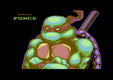
nice pic. I wasn't aware the artist behind these last activities is 16...
And it's apropriate to say in this case of this piece:
Cawabanga dude !!! \o/ ;) keep them coming. pillow shading works Ok in this case.
regarding the rules I agree with ptoing once you know the rules and applied them many times there comes time to break them.
like: there's no spoon :D
I remember my discussion with DK that in order to bring something new to scene I'm going to mix $03 cyan with $0a lred or $05 with $04 in my pictures
colors that makde no sense to mix back in 90's.
And now?
For example Jammer says that this color schemes are very unique. (I refer to one of his comments).
On one hand it's evolution of C64 gfx on the other hand is the theory of colors that we learned to apply in our pictures even we haven't studied art. we just learn by trying and noticing it looks good. |
User Comment
Submitted by ptoing on 16 November 2016
E$G: Fair enough.
ZeSmasher: You could maybe have some very minimal bg here seeing how big and prominent Don is. Maybe a brick wall or a faint skyline of NY. Anything more elaborate than that would not help the pic imo. But yeah, something minimal might set the mood a bit more. |
User Comment
Submitted by Smasher on 16 November 2016
| not bad. it'd be better with some background. |
User Comment
Submitted by rail slave on 16 November 2016
Thanks @ptoing, pacing myself, don't want to get too good too soon, still channeling my 16 year old self :P
also, @hedning this is based on the original Turtles (all red bands), hence also the white eyes(not that I was referencing any image, all off the top of my head) |
User Comment
Submitted by hedning on 16 November 2016
| But... Donatello has purple ninja colour. Rafael is red. |
User Comment
Submitted by E$G on 16 November 2016
@Ptoing: I do agree with you about Rail Slave improving, he has got a personal way to handle colors too.
About d64 is not a standard, consider is same loading time but if you wish to use it on a real floppy reader is already ready. At least we enjoy to share the dirlisting art that our friend Sink did. |
User Comment
Submitted by ptoing on 16 November 2016
I quite enjoy this picture. Dylan, you are certainly improving.
E$G: That said, is it really necessary to have a D64 with a dirlisting for a single picture, in 2016? |
|
|
|
 | Search CSDb |
|
 | Navigate |  |
|
 | Detailed Info |  |
|
 | Fun Stuff |  |
· Goofs
· Hidden Parts
· Trivia
|
|
 | Forum |  |
|
 | Support CSDb |  |
|
 |  |
|


