|
| |
|
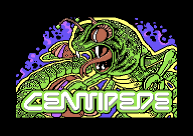
Centipede Arcade GFX #002 [2017] |
Credits :
Download :
Look for downloads on external sites:
Pokefinder.org
User Comment
Submitted by Dr.Science on 5 February 2017
User Comment
Submitted by Hoild on 4 February 2017
| +1 to top border sprites for showing the antennae. |
User Comment
Submitted by Moloch on 4 February 2017
| Looks great, thumbs up! Maybe some sprites at the top to complete the antenna? |
User Comment
Submitted by Frantic on 4 February 2017
| ...and I think it is done in just the right way |
User Comment
Submitted by Hoild on 4 February 2017
| It has good authenticity in reproducing the visual style of the arcade era, IMO. I liek! |
User Comment
Submitted by STE'86 on 4 February 2017
| i think the black is fine. its a good representation of the flat colour decals of the early 80s cabs. I might have tried for a lt grey background behind the blue bubbly bits but i can see that might have shown up the crop at the top much more |
User Comment
Submitted by TheRyk on 4 February 2017
yup, anti-aliasing and replace black by some shade of grey on skin would be great
otherwise quite kewl! |
User Comment
Submitted by Digger on 4 February 2017
| Nice composition, adding some anti-aliasing wouldn't hurt :D |
User Comment
Submitted by Stainless Steel on 3 February 2017
|
|
|
 | Search CSDb |
 |
|
 | Navigate |  |
|
 | Detailed Info |  |
|
 | Fun Stuff |  |
· Goofs
· Hidden Parts
· Trivia
|
|
 | Forum |  |
|
 | Support CSDb |  |
|
 |  |
|


