|
| |
Released At :
Datastorm 2017
Achievements :
C64 Graphics Competition at Datastorm 2017 : #3
Credits :
Download :
Look for downloads on external sites:
Pokefinder.org
User Comment
Submitted by Hammerfist on 19 February 2017
Thanks for the nice comments everyone!
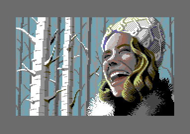
Originally the picture was meant for a small random release, but I didn't want to show up to Datastorm empty-handed like last X. I'm pretty pleased with how it all turned out, except the birches were a bit of a knee-fall due to lack of time and inspiration. They're not bad, but they remain just filler.
@Joe: Very funny that you had to mention the knitting, as I studied your dithering techniques for it :) Glad you like it! (As a side-note, apparently 'muts', which is the dutch word for her head gear, doesn't really translate to English. Closest I came was 'bonnet'...)
@Pal: I do not know who that is. My example for the face was a photo from an model called Yuval from Ami's Angels.
@Joe and Hoild: I agree the perspective for her head and bonnet isn't the same. I went for a slight fish-eye lens-like view from below but I think it's the bonnet that doesn't line up, not the head. Maybe because I started with her head in the first place. As a fix, let's say she piled her remaining curls all on one side under that thing and it's bulging :) |
User Comment
Submitted by Hoild on 12 February 2017
| The face is definitely out-of-perspective from the rest of the picture. |
User Comment
Submitted by Pad on 12 February 2017
| Awesome. Love the hair. She looks a bit like Chelsea Handler. :) |
User Comment
Submitted by Joe on 12 February 2017
| Lovely and yet very basic. Loved the geometric pattern on the knitted, felt there was something out of the proportion on the headskull though. Great! |
User Comment
Submitted by Ramon B5 on 12 February 2017
| Very nice pic again mr Hammerfist |
User Comment
Submitted by Scan on 12 February 2017
| Loving the curly hair! Btw, don't birches have a special meaning to scandinavic people, something about a new spring? |
User Comment
Submitted by Magnar on 12 February 2017
| Looked very dark red and bloody on the projector. But very nice picture and better when the light red is indeed light red ;) |
User Comment
Submitted by GH on 12 February 2017
| Beautiful~ and Whoow for Hairs and Hat:D |
User Comment
Submitted by saulc12 on 12 February 2017
| Beautiful style on this one. |
User Comment
Submitted by Magic on 12 February 2017
| Omg, Hammer.. I don't know how you do it over and over again.. :D |
User Comment
Submitted by Shine on 12 February 2017
| I really like the expression from the face! :D |
User Comment
Submitted by Motion on 12 February 2017
| Really like this. Well done! |
User Comment
Submitted by chatGPZ on 12 February 2017
|
|
|
 | Search CSDb |
 |
|
 | Navigate |  |
|
 | Detailed Info |  |
|
 | Fun Stuff |  |
· Goofs
· Hidden Parts
· Trivia
|
|
 | Forum |  |
|
 | Support CSDb |  |
|
 |  |
|


