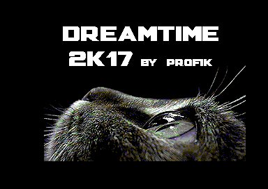
|
| |
Released At :
Arok Party 2017
Achievements :
Mixed Demo Competition at Arok Party 2017 : #6
Credits :
SIDs used in this release :
Download :
Look for downloads on external sites:
Pokefinder.org
User Comment
Submitted by Higgie on 4 January 2024
| i can't find the "ESC" key, that is mentioned on the first screen, on my 64. ;) ... this is far too dependend on special configuration/palette. it's conversions galore and to top it all off, it's in flickermode which makes me puke. :( to say something positive: the music is nice (but ripped). overall a disappointing production. |
User Comment
Submitted by KAL_123 on 25 November 2020
| Top! One of the best slideshows available. |
User Comment
Submitted by TheRyk on 7 October 2017
User Comment
Submitted by Scarzix on 4 October 2017
| Nice slideshow. Found a tiny bug and reported it under Goofs :-) |
User Comment
Submitted by Jak T Rip on 18 August 2017
User Comment
Submitted by Oswald on 15 August 2017
| yeah, Void uses this 'mode' in the turn disk part (by janee/breeze), also told Profi 1 on the party. On the projector screen the pictures looked better than nufli. |
User Comment
Submitted by Mixer on 15 August 2017
User Comment
Submitted by Copyfault on 14 August 2017
Really like the pictures presented in this collection!
The mode seems to be hires fli with x-shifts per line... but with the same display code used for both frames (only the vic-bank is changed!!). Hats off for achieving such colours plus an insane level of detail!
I faintly remember a discussion here on CSDb in which Oswald stated that the Turn disc-part of Void was showing such a mode - though I have to admit that the pictures in the dreamtime2k17-collection look better. Would be interesting to learn about the conversion algo behind it! |
User Comment
Submitted by JAC on 14 August 2017
| Great level of detail. I was hoping for details on the converter, too. |
User Comment
Submitted by algorithm on 14 August 2017
Indeed it is a tradeoff between color mix possibilities and flicker. On a CRT the flicker can be more noticeable in comparison with an emulator (e.g flicking yellow and white looks far darker on a crt.
On the plus4, there are more of a possibility of color choices hence it can be matched more closely with less flicker) - On a c64 far less less mix choices that produce less flicker. |
User Comment
Submitted by Yzi on 14 August 2017
Nice! Some of the pictures are quite "flashy" and some almost not flashy at all. Do you have "flashiness" as one of the selection criteria for color combinations? I didn't inspect where the disturbing flicker comes from, but it doesn't look good if you combine two colors that have too different luminance values. For example flickering between black and white won't look like mid-gray, it just looks bad. Just an idea, and you probably knew this already. It would be interesting to read an description on the conversion process and its development.
Edit: I watched it on a real C64 and a CRT. |
User Comment
Submitted by algorithm on 14 August 2017
| by looking at the code it is hires fli interlaced but also unique d016 writes per line to minimise error. |
User Comment
Submitted by Digger on 14 August 2017
| Some notes on this interlace mode would be nice to have :) |
User Comment
Submitted by Yogibear on 14 August 2017
User Comment
Submitted by morphfrog on 14 August 2017
User Comment
Submitted by Motion on 13 August 2017
User Comment
Submitted by bugjam on 13 August 2017
| Really astonishing. Now where is the pr0n version? :-P |
User Comment
Submitted by Thierry on 13 August 2017
|
|
|
 | Search CSDb |
|
 | Navigate |  |
|
 | Detailed Info |  |
|
 | Fun Stuff |  |
· Goofs (1)
· Hidden Parts
· Trivia
|
|
 | Forum |  |
|
 | Info on other sites |  |
|
 | Support CSDb |  |
|
 |  |
|


