|
| |
Released At :
Intro Creation Competition 2018
Credits :
SIDs used in this release :
Download :
Look for downloads on external sites:
Pokefinder.org
User Comment
Submitted by iAN CooG on 6 January 2019
User Comment
Submitted by Yogibear on 29 December 2018
User Comment
Submitted by Magic on 27 December 2018
nice idea..
whats next?
Red Dead Redemption? :D |
User Comment
Submitted by Golara on 27 December 2018
| I added a download to the version with exit on space. Nothing else changed. |
User Comment
Submitted by Joe on 27 December 2018
User Comment
Submitted by ws on 27 December 2018
| Yeah totally got that just now. This is a *very* cool detail! <3 |
User Comment
Submitted by Golara on 27 December 2018
| not only L has the extra tail going under other chars. In the scrolltext I use small and big letters to decide if it's supposed to have a tail, for example THIS IS A SCROlLER EXAMPlE MADAfAKA |
User Comment
Submitted by ws on 27 December 2018
| Very nice design, what i wanted to adress was mentioned before, though. Always dev for full border ;-) The double L char is very cool though! Is it a special char or do you auto detect it for all doubles? |
User Comment
Submitted by Golara on 27 December 2018
TheRyk: damnit, code is there but I commented it out last minute (had to save few bytes) and didn't uncomment it... I'll upload fixed version tomorrow morning.
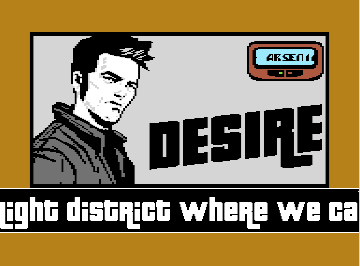
Rastalin: Big scroller uses 4 sprites on the sides, two on the left and two on the right. If you use the full border view in vice then yes you will see the sprites disappear because only 2 sprites don't fully cover the left border, but most demos deal with this problem and on a majority of displays its not visible anyway. The weird line on the right is the early sprite dma (happens if sprite x position is greater than $164). it could be fixed by making the first top line of sprite black and change to white later, but I postponed this fix till the very end and I had the code optimised so much I couldn't even add that small color change. The intro might appear simple, but the bottom scroller code is a bit complicated and with sideborder it takes a lot more space and rastertime. If I droped the sideborder I could easely have a bitmap on top, but instead the Cloude character and Desire logo fits exactly into 256 chars charset. The pager is made of sprites. |
User Comment
Submitted by TheRyk on 27 December 2018
i hate to say it but someone's gotta: press space to leave seems to be missing...
otherwise very stylish! |
User Comment
Submitted by Raistlin on 26 December 2018
Cool design! Really nice. The scroller font is fantastic.
Some glitches visible in the border scroller... particularly top-right and the clipping of the scroller on the left.
And I wonder whether the screen would've looked better in hires instead of multicolour mode?
Very nice idea, though, huge thumbs up :-) |
|
|
|
 | Search CSDb |
|
 | Navigate |  |
|
 | Detailed Info |  |
|
 | Fun Stuff |  |
· Goofs
· Hidden Parts
· Trivia (2)
|
|
 | Forum |  |
|
 | Info on other sites |  |
|
 | Support CSDb |  |
|
 |  |
|


