|
| |
|
To Dash or Not to Dash [2019] |
Released At :
Demobit 2019
Achievements :
Mixed Graphics Competition at Demobit 2019 : #5
Credits :
Download :
Look for downloads on external sites:
Pokefinder.org
User Comment
Submitted by ChristopherJam on 5 February 2019
| This is ace. Agreed on the loading pic feel. |
User Comment
Submitted by FABS on 5 February 2019
| It remind me some of the 80's loading pics. Well done! |
User Comment
Submitted by Viza on 5 February 2019
@Digger:
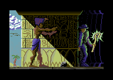
The recollection pic looks fantastic, but I'm not sure the hieroglyphs are directly comparable in the two pieces due to the size difference... (20-30 pixel vs 5-6)
I don't know what else can be done in such a small size...
(Again I'm not whining, or being defensive here, just discussing the topic at hand)
The dither/antialias here is definitely limited by my abilities in big part... I'll keep on learing, these are my first two released pics :) |
User Comment
Submitted by Smasher on 4 February 2019
| great pic! it looks very cool and very finished to me! :) |
User Comment
Submitted by Digger on 4 February 2019
| @Viza: Unfinished for me is lack of dithering/anti-aliasing, it doesn’t take much time but helps a lot. For hieroglyphs check Mirage’s approach Recollection #2 |
User Comment
Submitted by Viza on 4 February 2019
Can I ask what parts make you feel that it is unfinished?
Thats a genuine technical question, not some whining or something. :) I don't really feel it unfinished, and want to learn :)
Is it the mummy's far limbs? Something other |
User Comment
Submitted by MMS_Z on 3 February 2019
Very nice!
I partially agree with the statement "unfinished" (maybe the mummy leg and arms towards the wall could be deeper brown, not reddish, or the adventurer's shoe could be different colot, but C64 palette limitiation, eh... Try the Plus/4! :-) ).
On the other hand I see some really nice shadow depth execution, especially the sunlight/shadow contrast on the wall.
A very good story can be read on the hieroglyph wall! |
User Comment
Submitted by Shine on 3 February 2019
| I like it dude! :D (Idea is cool, but execution is a bit "unfinished" imho) :) |
|
|
|
 | Search CSDb |
 |
|
 | Navigate |  |
|
 | Detailed Info |  |
|
 | Fun Stuff |  |
· Goofs
· Hidden Parts
· Trivia
|
|
 | Forum |  |
|
 | Support CSDb |  |
|
 |  |
|


