Credits :
SIDs used in this release :
Download :
Look for downloads on external sites:
Pokefinder.org
User Comment
Submitted by Doc Snyder on 22 May 2019
User Comment
Submitted by Golara on 22 March 2019
User Comment
Submitted by TheRyk on 21 March 2019
| wonderful! stylish and fresh |
User Comment
Submitted by ChristopherJam on 21 March 2019
Nice work, and welcome aboard.
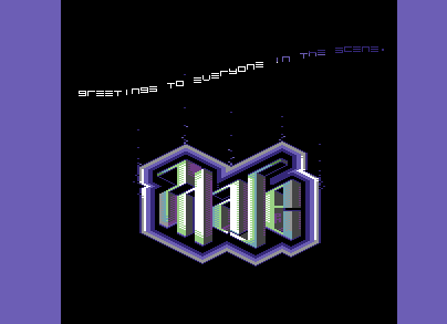
That logo is lovely! Great sense of depth and solidity. |
User Comment
Submitted by phvse on 21 March 2019
| @Jammer ok, that makes sense. correct, i wasn't checking the raster line for the other call. it sounded normal to me though, but i guess i should trust numbers over senses :) |
User Comment
Submitted by Jammer on 21 March 2019
| @phase: if you call player outside irq without cheecking line, that's precisely why it behaves like that ;) Multispeeds in general should always be called at even intervals if possible - 156 lines in this case. Timer based interrupts are most convenient here, especially for higher multispeed values. |
User Comment
Submitted by phvse on 21 March 2019
@all thank you, i feel welcome :)
@Dr.Science i didn't notice those in vice earlier, but now that i've changed the vic model i can see them... really annoying :) thanks for pointing it out, definitely not letting that slide in next time!
@Jammer really cool tune! i didn't even notice that, but i'll take the composer's word for it :) i'm calling it once in irq and once outside of it, maybe that's why? |
User Comment
Submitted by Motion on 21 March 2019
| Cracking logo! Ver, ver nice. ; ) |
User Comment
Submitted by Mibri on 21 March 2019
| Logo is really, really sharp! Great! |
User Comment
Submitted by Yogibear on 21 March 2019
| Especially like the logo! |
User Comment
Submitted by Jammer on 20 March 2019
| Very cool firstie! :) Logo reminds me of GP's Razorsharp Intro ;) Nice to hear my oldie but my question is if you call multispeed routine at even intervals or one by one? Rhythm got little wonky ;) |
User Comment
Submitted by Shine on 20 March 2019
User Comment
Submitted by Brittle on 20 March 2019
| Nice little firstie! I expected some kind of soda-fizz effect on the neat logo, but eh, I liked it even if it’s static anyway. Keep it up Phase and welcome :) |
User Comment
Submitted by Dr.Science on 20 March 2019
Really nice intro for a first one! Welcome to the C64 :-)
Just one minor point: next time make sure to get rid of those Grey-dots :-) |
|
|
 | Search CSDb |
 |
|
 | Navigate |  |
|
 | Detailed Info |  |
|
 | Fun Stuff |  |
· Goofs
· Hidden Parts
· Trivia
|
|
 | Forum |  |
|
 | Info on other sites |  |
|
 | Support CSDb |  |
|
 |  |
|


