|
| |
Released At :
Function 2019
Achievements :
Mixed Graphics Competition at Function 2019 : #4
Credits :
Download :
Look for downloads on external sites:
Pokefinder.org
User Comment
Submitted by F7sus4 on 1 June 2020
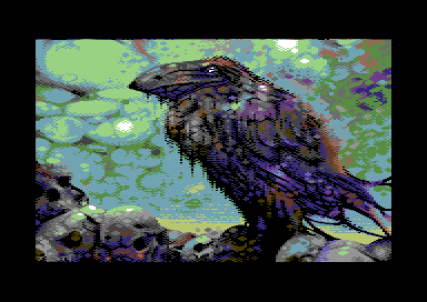
| I love how you use all those bright-and-shiny colors, yet manage to take all what is grim about them with just the form and structure. |
User Comment
Submitted by Jak T Rip on 3 January 2020
| Love it! Rare atmosphere on a 64. |
User Comment
Submitted by Hammerfist on 16 December 2019
I’m seeing the crow facing towards me or something to my far left anyway. It also looks like a beefed up version of a crow for some reason, but I’m in the ‘mc’lovin’ it’ corner :)
Also, isn’t the bulge under his beak his crop/craw? |
User Comment
Submitted by Yogibear on 23 September 2019
User Comment
Submitted by rail slave on 16 September 2019
User Comment
Submitted by Jazzcat on 15 September 2019
| Like the rawness/gritty pixels here. |
User Comment
Submitted by ChristopherJam on 15 September 2019
Oh this is excellent, very brooding.
FWIW I saw the crow as facing the viewer from the moment I first saw the pic. |
User Comment
Submitted by Magnar on 15 September 2019
| I think people that look at the crow as if it has its back toward the camera and looking into the distance (top-left corner), instead of the front of the crow looking down on the skulls (bottom left), then they get some perspective issues. But when I look at the crow as if I see the front of it looking at the skulls then it looks really cool! :) One of those pictures where you can see it either way, I think. Maybe that is why some doesn't like it because they see it the "wrong way". The edge of the lower part of the bird break is causing the perspective confusion, I think. |
User Comment
Submitted by E$G on 15 September 2019
| The crow is the thing I like less, all the rest is usual good standard |
User Comment
Submitted by TheRyk on 14 September 2019
| liked some of your previous works better, though this one is pretty good. otherwise zmash keeps reading my mind ;) |
User Comment
Submitted by Pantaloon on 14 September 2019
| first Facet picture i really dont like at all. |
User Comment
Submitted by Smasher on 14 September 2019
| great one. but the black crow isn't that black :) |
User Comment
Submitted by Joe on 14 September 2019
User Comment
Submitted by AüMTRöN on 14 September 2019
| Skulls and crows <3 Background is fantastic also. |
User Comment
Submitted by Oswald on 14 September 2019
User Comment
Submitted by Facet on 14 September 2019
| @Mikael.. I actually did the x-flip .. sometimes it just looks (feels) a bit better. |
User Comment
Submitted by Mikael on 14 September 2019
| Cool, Facet! A bit more ”free” than the others, like an oil painting. Well done! Curious, question: did you flip it horizontally? Liked it better this way? (noticed your name tag) |
User Comment
Submitted by Dymo on 14 September 2019
User Comment
Submitted by G-Force on 14 September 2019
User Comment
Submitted by Raistlin on 14 September 2019
| Wow! Best yet for me - this one’s amazing! |
User Comment
Submitted by hedning on 14 September 2019
User Comment
Submitted by Magic on 14 September 2019
| On the Function stream it looked awefull :/ But here on csdb its very cool again.. the skulls to.. |
|
|
|
 | Search CSDb |
 |
|
 | Navigate |  |
|
 | Detailed Info |  |
|
 | Fun Stuff |  |
· Goofs
· Hidden Parts
· Trivia
|
|
 | Forum |  |
|
 | Support CSDb |  |
|
 |  |
|


