|
| |
|
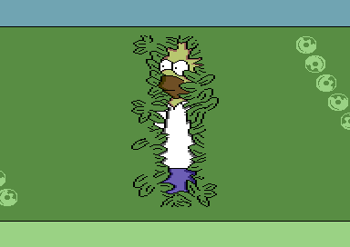
Hedge of Disgrace - Only Sprites Compo Edition [2020] |
AKA :
Duff Design
Released At :
Only Sprites Compo
Credits :
SIDs used in this release :
Download :
Look for downloads on external sites:
Pokefinder.org
User Comment
Submitted by wacek on 8 January 2021
User Comment
Submitted by Smasher on 7 January 2021
| @wacek: LOL. sceneban MSL! :) |
User Comment
Submitted by Raistlin on 7 January 2021
| Wacek: I also released this before the compo ;-p |
User Comment
Submitted by Jammer on 7 January 2021
| @wacek: HAHAHAHAHAHAHAHAHAHAHAHA! <3 |
User Comment
Submitted by wacek on 7 January 2021
| Come on Raistlin, MSL guys do that all the time ;) there's nothing wrong with that. |
User Comment
Submitted by Raistlin on 7 January 2021
| Jammer: I won't enter my own compo :-p |
User Comment
Submitted by Jammer on 27 November 2020
User Comment
Submitted by psych on 27 November 2020
User Comment
Submitted by Bob on 27 November 2020
User Comment
Submitted by Raistlin on 27 November 2020
| Joe: Ohhhhh... maybe I was still linking in some test sprites that I had... oops! |
User Comment
Submitted by Joe on 27 November 2020
Ah no! Thanks, but I didn't mean that. :D
It's just that the sprites I found in the mem said "Hedge of Disgrace" and I wondered why it wasn't on the screen. I'm running Vice 3.1 still, so it was maybe a hidden feature or just a bug not shown in the emulator.
BTW love that rotation! |
User Comment
Submitted by Raistlin on 27 November 2020
@Joe: i took a few shortcuts with this just out of pure laziness. I use 4x9 regular multicolour sprites for one part (using green=transparency, black, white and yellow). All other colours are done with single colour x-expanded sprites. The latter “just” fit within a 48px wide area - so I was able to place 3 sprites all the way down, overlaid onto the multicolour layer, and I just need to update the Sprite indices and the colours. The 8th Sprite is used for the donuts of course.
The laziness comes from that this method gave me a fixed number of exactly 8 sprites on every line - making my raster timing simple. I could’ve coped with variable numbers of course - but this was intended just as a very quickly hacked together example for the compo ;-) .. the other act of laziness was that I could of course have also done the trousers with a colour split on the multicolour layer sprites ... but, yeah, I had other projects I wanted to get back to so just did this the quickest way I could ;-) |
User Comment
Submitted by Joe on 27 November 2020
I love sprites and screens which uses them in a great way!
This is no exception so I got a bit curious about how things were resolved and pressed freeze on the Action Replay cartridge (well, not really since I don't use the real hardware anymore) but found those sprites there in the memory. Do I miss something on the screen? Been warping it fastforward for ever but where is the textline? :D
Nice work! |
User Comment
Submitted by Raistlin on 27 November 2020
| Sasq: this is just a cheap demo ... it doesn't deserve to be in the top 500, let alone the top 10 ;-) .. that said, looking around at some of the other entries in the top 10, maybe it does deserve to be here ;-p |
User Comment
Submitted by Sasq on 27 November 2020
| Congrats on reaching 2nd place on Top onefile Demos :) |
User Comment
Submitted by Monte Carlos on 27 November 2020
User Comment
Submitted by Raistlin on 27 November 2020
Wil: if you stare at them long enough, you’ll eventually see that they’re my poor attempt at drawing rolling donuts ;-)
And... I wouldn’t look for a hidden message any longer if I were you ;-) |
User Comment
Submitted by wil on 27 November 2020
| Great work! After watching this now for some time I'm wondering... do the disc sprites carry some meaning, do they spell out a text? Or are they just rotating into a random position? |
User Comment
Submitted by bepp on 26 November 2020
User Comment
Submitted by Dr.Science on 26 November 2020
User Comment
Submitted by Smasher on 26 November 2020
| fantastic! now waiting for "Hedge of Disgrace - ECM Mode Demoeffect Compo Edition" :) |
User Comment
Submitted by JackAsser on 26 November 2020
| Fantastic release but not really Booze standard. We would have had 2px thick black bars. |
|
|
|
 | Search CSDb |
|
 | Navigate |  |
|
 | Detailed Info |  |
|
 | Fun Stuff |  |
· Goofs
· Hidden Parts
· Trivia
|
|
 | Forum |  |
|
 | Support CSDb |  |
|
 |  |
|


