|
| |
Released At :
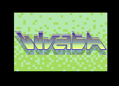
C64GFX.com CharSet Logo Compo 2024
Achievements :
C64 Graphics Competition at C64GFX.com CharSet Logo Compo 2024 : #17
Credits :
Download :
Look for downloads on external sites:
Pokefinder.org
User Comment
Submitted by Bob on 19 March 2024
User Comment
Submitted by Yogibear on 24 February 2024
User Comment
Submitted by zscs on 20 February 2024
| At the first sight I thought it's a Multicolor pic but it isn't! Really clever colour choices and design! <3 |
User Comment
Submitted by psych on 17 February 2024
User Comment
Submitted by Joe on 16 February 2024
No, it's now the compo begins, haven't you noticed ;D
Create my friends, create! |
User Comment
Submitted by Brush on 14 February 2024
| I think the compo is over now :) |
User Comment
Submitted by katon on 13 February 2024
| Innovative! Very stylish! |
User Comment
Submitted by zscs on 13 February 2024
| Really clever and nice! <3 |
User Comment
Submitted by Frantic on 13 February 2024
User Comment
Submitted by Jammer on 13 February 2024
| Even charmode cannot stop you from using illegal colours! Damn! |
User Comment
Submitted by Soya on 13 February 2024
| Just great! The logo design is awesome! |
User Comment
Submitted by Flex on 13 February 2024
| Veeery stylish! ..and those colours!! Job well done, although expected nothing else. |
User Comment
Submitted by hedning on 12 February 2024
User Comment
Submitted by Deev on 12 February 2024
| Beautiful. It has a feel of a classic demo scene logo, but there's also something completely new about it as well. I love the design, the colours, the lettering |
User Comment
Submitted by Morpheus on 12 February 2024
| This is ART. And math. Art Math. |
User Comment
Submitted by Scrap on 12 February 2024
| yep, just read it in your workstages. 190 chars is even more impressive! |
User Comment
Submitted by Oswald on 12 February 2024
| woa, you totally went out of the box and how spectacularly. fantastic. |
User Comment
Submitted by Joe on 12 February 2024
| Thanks Scrap, I think we counted it to 190 chars. PixCen tells it's 181, so I'm a bit unsure, so there was in fact more space to do stuff, but I wanted to stop here and not overdo it. |
User Comment
Submitted by Scrap on 12 February 2024
| cleverly done! looks like a fullscreen multicolor image. Great how you squeezed it into 256 chars! |
User Comment
Submitted by Digger on 12 February 2024
| Incredible! Great usage of double height pixels. And the W looks like open hands. |
User Comment
Submitted by Jetboy on 12 February 2024
| Awesome! It makes impression there is more than 256 characters used :) Good job! |
User Comment
Submitted by Mikael on 12 February 2024
| Supercool design and the colors are most tasteful too! Great job, Joe! |
User Comment
Submitted by Mibri on 12 February 2024
| Love it, and it's really interesting to see those workstages, even with my graphics idiot eyes! :) |
|
|
|
 | Search CSDb |
 |
|
 | Navigate |  |
|
 | Detailed Info |  |
|
 | Fun Stuff |  |
· Goofs
· Hidden Parts
· Trivia
|
|
 | Forum |  |
|
 | Support CSDb |  |
|
 |  |
|


