|
| |
Released At :
Assembly 1995
Achievements :
C64 Demo Competition at Assembly 1995 : #3
Credits :
SIDs used in this release :
Download :
Look for downloads on external sites:
Pokefinder.org
User Comment
Submitted by jailbird on 25 March 2003
MR.SEX about the coding,
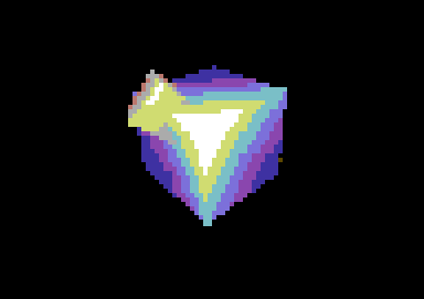
Yes, Beyond Force is back again with a contribution for Assembly '95. The demo is again fully coded by Gremlin (who is in the army now) and got the 3rd prize in the competition. Okey, after an old Beyond logo the credits are being displayed with dots which move out nicely. Then the loader starts and more text is being flooded on the screen. There is a little annoying bug on that routine, because before and after loading the music is being played faster. Not a big deal though. The first part is a texturemapper in 4*4 fli resolution. Unfortunately those textures are being rotated only over Y-axis and the speed of the routine is quite slow. The same texture is back in the next part, which is Gremlin's doom imitation. Well, this is again quite slow and could easily be even precalculated, because the movement is so simple. After another loading a thing called "bobtwister" comes in and "bobs" begin to fall over an animated sprite-star in very nice patterns. Eventhough the routine may not be a very special it really looks just great! Especially after those slower ones. The last effect is a gouraud vector routine in 4*4 resolution. First a few simple objects come in and out. And finally they both come back with a space cut effect. Especially this is too slow. But as it says in the end upscroller, Gremlin didn't have time to optimize those routines. Well, it was nice to see another demo from Beyond Force, but Gremlin has surely got the skill to make a better one. Let's see what he brings with him next year...
63 % for coding...
EARTHQUAKE about the graphics,
Hmm, an easy job for me, as this demonstration contains only 2 graphics. The first one hits your screen at the very beginning. It is a Beyond logo in only 4 colors - blue, light blue, cyan and black. This one looks really nostalgic and when I watched this logo I felt set back some years. No wonder, as this logo is quite old, from '90 or earlier, I think. All the characters have the same filling - just the typical style of the late 80's. Now let's have a look on the Endpicture, which is also the last one in this demo. The letters of this image, which is a fullscreen one btw., feature a very old style. Two candles burn beside the logo. These candles were just mirrored what I personaaly don't like. Between the letters a spider produced a cobweb - a bit less for 7 years... ;) Well, the filling is good and underline the general impression of a non-fast production.... made by Dominators Design in '91 if I'm right. Hopefully Gremlin gets some more graphics for his next annual demo.
Ratings for the graphic: 57 %
SYNDROM about the music,
Hmm, this demo contains two tunes, unfortunately both of them have been used before...The first one was made by PROSONICS and is nothing but great! I wish more of today's composers would be able to do music of that quality... The music in the end-part is an ancient piece by Danko and fits perfectly to the part, as it spreads pure nostalgia...
19 % for the music...
(ORIGINALLY PUBLISHED IN PULSE) |
|
|
|
 | Search CSDb |
 |
|
 | Navigate |  |
|
 | Detailed Info |  |
|
 | Fun Stuff |  |
· Goofs
· Hidden Parts
· Trivia
|
|
 | Forum |  |
|
 | Info on other sites |  |
|
 | Support CSDb |  |
|
 |  |
|


