|
| |
AKA :
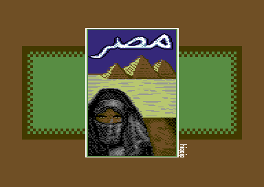
Giza, Misr, matarr ;)
Credits :
Download :
Look for downloads on external sites:
Pokefinder.org
User Comment
Submitted by Higgie on 18 January 2007
User Comment
Submitted by blackdroid on 7 December 2006
| ah yeah "misr" is a nickname I think for egypt. ok I see that you want "s'ad" not 'tah' on the second letter :) they are similar. |
User Comment
Submitted by Higgie on 7 December 2006
thanx again for the comments, guys!
@blackdroid: hmmm... i wanted to write 'Misr' which is AFAIK the arabic name for egypt (correct me if I'm wrong!). But my spelling might be wrong as I'm not really good in writing Arabic. ;) |
User Comment
Submitted by blackdroid on 5 December 2006
| Quite nice work. now if I only would remember what "matarr" meant. |
User Comment
Submitted by leonofsgr on 5 December 2006
User Comment
Submitted by Tch on 5 December 2006
Hello Higgie,
there is nothing wrong with the pixelling.
It´s probably the picture that got you a 3.
Doesn´t have to mean anything.
Lots of downvoting going on anyway..
Oswald gives some good advise,but keep doing your own thing. |
User Comment
Submitted by jailbird on 5 December 2006
| I think you did more than well, so just keep on with the pixelling and don't let a low vote discourage you! |
User Comment
Submitted by Oswald on 5 December 2006
| higgie, well I'm not a graphician, but they tell me they learn the most from eachother. You should check many many pics, very carefully to learn how others mix colors do dithering, etc. |
User Comment
Submitted by Higgie on 5 December 2006
| Thanx for your comments and votes. But please give me a hint what I could improve when voting a '3'. It would really help me alot as I haven't done anything between 1993 and 2006. And the taste and techniques did change a little in that time. And I'm willing to learn and improve my style. |
User Comment
Submitted by Jak T Rip on 4 December 2006
| Funny, when I look at the figure I get an impression of sand. Maybe even a stronger one than when I look at the sand. |
User Comment
Submitted by Twoflower on 3 December 2006
| Like the colors, like the motive. This would have fitted nicely in our x-masdemo Candy, released a couple of years ago. |
User Comment
Submitted by Style on 3 December 2006
| Nice oldschool pic. Well done, keep it up. |
User Comment
Submitted by Jon on 2 December 2006
|
|
|
 | Search CSDb |
|
 | Navigate |  |
|
 | Detailed Info |  |
|
 | Fun Stuff |  |
· Goofs
· Hidden Parts
· Trivia
|
|
 | Forum |  |
|
 | Support CSDb |  |
|
 |  |
|


