|
| |
Credits :
Download :
Look for downloads on external sites:
Pokefinder.org
User Comment
Submitted by Jak T Rip on 28 July 2007
User Comment
Submitted by yago on 26 June 2007
User Comment
Submitted by RaveGuru on 25 June 2007
User Comment
Submitted by Stainless Steel on 24 June 2007
User Comment
Submitted by Steppe on 24 June 2007
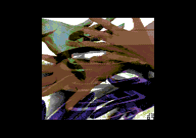
| "Hm, not bad! Give it 7 or 8?" I thought on first sight. But then I saw that second layer, what looks like a reflection of 4 stacked boats in a window! It's constantly playing tricks on my brain, and it really leaves me baffled how one can create all that depth in just 16 colours. Awesome, really! |
User Comment
Submitted by Mermaid on 24 June 2007
Oh noes, another standalone picture release, someone call the scene police. And omg it has a signature in the corner as well, this just won't do.
Nice picture btw. Hugs and cookies to James <3 |
User Comment
Submitted by jailbird on 24 June 2007
| I am really sorries for not liking it but although it is handpixelled and probably holds a huge amount of precious working time it still looks like a five minute wirejobbed photoshop montage to me. |
User Comment
Submitted by Zyron on 22 June 2007
| Hoild: "In large amounts" |
User Comment
Submitted by Radiant on 22 June 2007
| I can nothing but wholeheartedly disagree with Jailbird here. |
User Comment
Submitted by Hoild on 22 June 2007
Zyron: Why not quote Depeche Mode?
"The grabbing hands
grab all they can
Everything counts
in great amounts"
|
User Comment
Submitted by Jammer on 22 June 2007
| looks a bit like converted rendering but knowing joe's skill i believe that it's handmade ;) |
User Comment
Submitted by Zyron on 22 June 2007
The so-called "artefacts/color clashes" make the picture. "Greed"; I grab whatever within reach no matter clashes or not.
Great piece of art James! |
User Comment
Submitted by jailbird on 22 June 2007
| Not too much fond of it this time, sorry. The artefacts/color clashes give an edgy impression. Seen much better pieces from Joe before. Excellent representation of transparency, though. |
User Comment
Submitted by CreaMD on 21 June 2007
| Really good use of the technique. Thumbs up. |
User Comment
Submitted by DCMP on 21 June 2007
| Wow I really like this design |
User Comment
Submitted by Hoild on 21 June 2007
Another of those C-64 gfx releases that I can sum up as 'refreshing', regarding both the choice of subject and the technique in use.
|
|
|
|
 | Search CSDb |
|
 | Navigate |  |
|
 | Detailed Info |  |
|
 | Fun Stuff |  |
· Goofs
· Hidden Parts
· Trivia
|
|
 | Forum |  |
|
 | Support CSDb |  |
|
 |  |
|


