|
| |
Released At :
Backslash 2007
Achievements :
C64 Graphics Competition at Backslash 2007 : #1
Credits :
Download :
Look for downloads on external sites:
Pokefinder.org
User Comment
Submitted by Ed on 12 August 2007
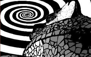
This piece of Ho-man art went from a straight 8 down to a 2. This picture was nice at a first glimpse but those pixels, and that spiral did not cut it and really made me rethink my vote. I have a real hard time to actually make up my mind about it.
<Edit> Removed offensive language & re-edited some...
|
User Comment
Submitted by Oswald on 23 July 2007
| Sander, that comparison was too much for my taste :P and besides the wrath guys or electric, or ptoing, or (the list goes on and on) got much closer.... |
User Comment
Submitted by Sander on 23 July 2007
@Twoflower, just by merely looking at the image, it's a matter of taste. But you cannot leave out the social context or the concept of this serie to judge it. I mean, when the creativity is in the vision/concept, it does not neccesarily have be in the execution...
Anyway, don't get me wrong - i think this picture feels fresh, i consider it a stylized collage, highly acceptable for that matter :)
And on top of all; Hollowman is probably the closest the scene has gotten to an icon like Andy Warhol :) |
User Comment
Submitted by Ed on 23 July 2007
Warhol worked in a completely different context than compaired to what we guys are doing in our scene. Besides, things where different back then. If you really are going to do some matches, please do focus on the differences as well.
|
User Comment
Submitted by Twoflower on 23 July 2007
| Andy Warhol was quite a creative guy. His sculptures with the lined-up Brillo-boxes and his less known paintings are really brill, as well as the concept of pop-art which he explored a bit too much of. As an image, though, I find it A) more creative to take a photo, pixel it into a semi-abstract pattern and add a kind of vortex to it than to B) take a photo, make a screen-print out of it and add a kitchy background-color. |
User Comment
Submitted by Sander on 22 July 2007
| @Hollowman: Y of ES. (but you know what i mean) |
User Comment
Submitted by Intensity on 22 July 2007
| It's about the message behind Hollowmans productions. I am for sure a disciple of hollowm. Dude, I believe in you! Seeing is Believing! Even if everything I "SEE" is related to GHEY STUFF muhahaha |
User Comment
Submitted by hollowman on 22 July 2007
| Sander, are you saying I'm less creative than a dead guy? (i hope i misunderstood) |
User Comment
Submitted by leonofsgr on 22 July 2007
| not bad hi-res pix \o/ and cool original... |
User Comment
Submitted by Sander on 22 July 2007
| Are you saying Hollowman is more creative than Andy Warhol? (i hope i misunderstood) |
User Comment
Submitted by Twoflower on 22 July 2007
User Comment
Submitted by Ed on 22 July 2007
| *ehhrmmmm that .jpg was cool and well.. ehm nice spiral. |
User Comment
Submitted by ptoing on 22 July 2007
I just don't get the point, really.
Just taking a photo of a part of a Gaudi building and tracing over it and adding a silly swirl. WHY? It's about as uncreative as it gets in my opinion. |
User Comment
Submitted by Puterman on 10 July 2007
| When Hollowman decides to release shit in the gfx compo, you know it's going to be ace. I didn't know he was doing this, and when I saw his name on the screen, I immediately started thinking of He-Man and Carl-Philip. This one was no disappointment. |
User Comment
Submitted by Jammer on 8 July 2007
| Fuckin' refreshin'! Nothing but 10. |
User Comment
Submitted by jailbird on 8 July 2007
| What Oswald and oys said! |
User Comment
Submitted by Oswald on 8 July 2007
User Comment
Submitted by oys on 8 July 2007
User Comment
Submitted by RaveGuru on 8 July 2007
Awesome AND original picture!
Great work!
|
User Comment
Submitted by Radiant on 7 July 2007
| I didn't know the graphics competitions were about making the most original pictures... |
User Comment
Submitted by ptoing on 7 July 2007
User Comment
Submitted by Ed on 7 July 2007
User Comment
Submitted by Optimus on 7 July 2007
| Quite inspiring picture. Nice use of highres and grey colors. |
User Comment
Submitted by Motion on 7 July 2007
| I'm a sucker for hi-res. Gives me an Arkanoid vibe! (as bizarre as that sounds!) Nice. |
|
|
|
 | Search CSDb |
|
 | Navigate |  |
|
 | Detailed Info |  |
|
 | Fun Stuff |  |
· Goofs
· Hidden Parts
· Trivia
|
|
 | Forum |  |
|
 | Support CSDb |  |
|
 |  |
|


