|
| |
 |
Release Date :
12 August 2007
Type :
C64 Graphics
(MultiColor)
|
AKA :
N7
Released At :
Primary Star 2007
Achievements :
C64 Graphics Competition at Primary Star 2007 : #1
Credits :
Download :
Look for downloads on external sites:
Pokefinder.org
User Comment
Submitted by Sander on 14 August 2007
| @WEC: uhm... right, your point being? :) |
User Comment
Submitted by tempest on 12 August 2007
| Thank you for giving the final deathblow to sword & sorcery pictures. |
User Comment
Submitted by DCMP on 12 August 2007
| Thanks for the feedback tempest. |
User Comment
Submitted by tempest on 12 August 2007
Ok, back off, postmodernist hounds.
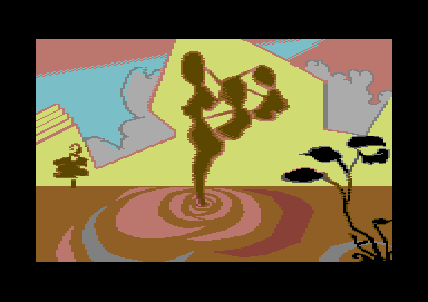
We are dealing with a 160x200 Commodore 64 picture. There are certain technical aspects you need to know in order to perfect your vision in this medium. I find it hard to believe that DCMP's vision included color clashes, bad antialiasing etc. Just look at the butt-ugly work on the statue's left side. Making those curves better is kids' stuff. Yet the maker fails on these simple tasks. Yes, I know, some find this kid-just-found-koala-paint-1986-style charming, maybe even essential, but this picture doesn't seem to be any cultural referance in that sense, but just badly pixelled. I also find it hard to believe this picture would be anything less if it were pixelled better.
Bad analogy time: if you want to make a film, you'd better know something about editing, as having good shots on celluloid isn't enough. If you compose for an orchestra, you'd better know the limits of each instrument and how they behave in certain pitches, as having a set of notes isn't enough. If you want to paint a picture...
Ok, now to I like/don't like section:
I like the picture. I don't like some of the color choises, especially in the lower part. I also think that too much space was wasted on the lower part of the scenery, unbalancing the picture (and the gray curve that gets cut off isn't helping at all.) I like how the tree in the background and the branches in the foreground balance the picture, as the statue is placed in the center. I like the colors in the upper part of the picture.
I like DCMP's works in general, but I also see that she isn't developing in this medium. |
User Comment
Submitted by Ed on 12 August 2007
The family concept takes on different meaning with the 2 other versions you have uploaded links to.
I think the "strings-attached" makes the picture a bit more easy to understand. |
User Comment
Submitted by DCMP on 12 August 2007
@Sander I made several versions, one with a woman in a statue pose, one with a whole family and somehow thought it was too obvious. Like making a picture with a tree and a house and some grass. So I changed it to being something more abstract to think about it. And I like the honest opinions anyway, even though I might complain. I ask for them :)
I added a screenshot of 2 other versions to the downloads as they are basically the same pics. Bad blur as I could not transfer them to d64. |
User Comment
Submitted by Ed on 12 August 2007
This is a great picture.
Some of the comments here are worse then when I was 3 years old.
|
User Comment
Submitted by Sander on 12 August 2007
"The thing in the middle was first just a woman, but i found it too normal so I changed it to something more abstract."
Ok... Makes me wonder what you're really after. Especially when referring to the 'abstract art of Joe', makes your motives sound very tricky. Where i feel joe's abstract experiments are on a bigger track of a vision, i fail to see yours'. Taste is a good hideout but makes it sound like selling the emperor's clothes.
Personally i like the image, purely based on the first impression. I guess that's what most comments are based on. |
User Comment
Submitted by Scout on 12 August 2007
User Comment
Submitted by DCMP on 12 August 2007
@Scout. Some like the pictures composed of googled up photos, some like the really abstract art of Joe. Tastes differ, no need to insult.
@Medicus The thing is the middle is a statue.
I actually do like to keep a lot very abstract, though I know many need to have a clear image of what it should resemble to be able to like it.
I like it when people have to look at the image for a while to get an impression of all depicted in it.
I probably will make some pictures like beneath subspace again in the future though.
|
User Comment
Submitted by Steppe on 12 August 2007
| I'm really fond of your style, especially your latest pics were right after my taste, DCMP! |
User Comment
Submitted by Linus on 12 August 2007
| My 3 year old niece could NOT do this. I prefer this one a lot over the other entries. |
User Comment
Submitted by Medicus on 12 August 2007
| Cant really judge what i cant recognize... what is that in the middle? Some silouette of a woman? |
User Comment
Submitted by Scout on 11 August 2007
"My 3 year old niece could do this".
Call me a culture bully but the label Triad on this picture couldn't distract me from the colorclashes, errors and crappy composition.
Seen better work from miss DCMP and better entries in this compo. |
User Comment
Submitted by leonofsgr on 11 August 2007
User Comment
Submitted by Deev on 11 August 2007
| nice! really like the colour selections and the kind of absract ripples at the bottom. |
|
|
|
 | Search CSDb |
 |
|
 | Navigate |  |
|
 | Detailed Info |  |
|
 | Fun Stuff |  |
· Goofs
· Hidden Parts
· Trivia (1)
|
|
 | Forum |  |
|
 | Support CSDb |  |
|
 |  |
|


